Button | Description |
|---|
 (Bold) | Sets selected text to bold or indicates that the text you are about to type will be bold. If you press this button when bold text is selected, the bolding is removed. (Keyboard: Ctrl+B) |
 (Italic) | Sets selected text to italic or indicates that the text you are about to type will be italic. If you press this button when italic text is selected, the italic is removed. (Keyboard: Ctrl+I) |
 (Underline) | Underlines selected text or indicates that the text you are about to type will be underlined. If you press this button when underlined text is selected, the underlining is removed. (Keyboard: Ctrl+U) |
 (Bullet list) | If the current paragraph does not have a bullet, adds a bullet and changes the paragraph's indent. If the paragraph has a bullet, this command removes the bullet and removes a level of indenting. When you press Enter within or at the end of a paragraph, the next paragraph also has a bullet. To end the bullet list, either type two returns or reselect this icon. |
 (Numbered list) | If the current paragraph does not have a number, adds a number and changes the paragraph's indent. If the paragraph has a number, this command removes the number and removes a level of indenting. If the preceding paragraph is part of a numbered list, selecting this command adds it to that list. When you press Enter within or at the end of a paragraph, the next paragraph also has a number. To end the numbered list, either type two returns or reselect this icon. |
 (Decrease indent) | If the current paragraph or selected paragraphs are indented, it removes a level of indenting. |
 (Increase indent) | Adds a level of indenting to the current paragraph or to selected paragraphs. |
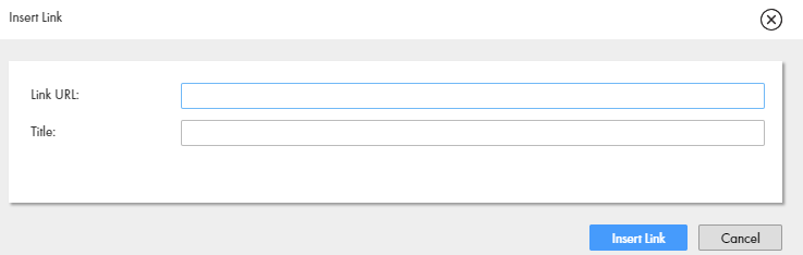
 (Insert/edit link) | Changes the selected text into a link. After you select this button, Guide Designer displays the following dialog: The files in this dialog are: - - Link URL: Where you type a Web address.
- - Title: Text that appears when a user moves the cursor over the link. (This text may not appear in all browsers.)
If you press this button while your cursor is anywhere in a link, you can edit the link's information. If you forget to select text, the link will not display. However, it will be created. Correct this by pressing the <> button to locate the link. If you know HTML, you can edit the link directly. If you do not, just delete it. (An empty link's text is similar to "<a href=""><a>".) |
 (Remove link) | Removes a previously created link. Your cursor can be anywhere within the link. The text in the "Text to display" field remains after you select this button. |
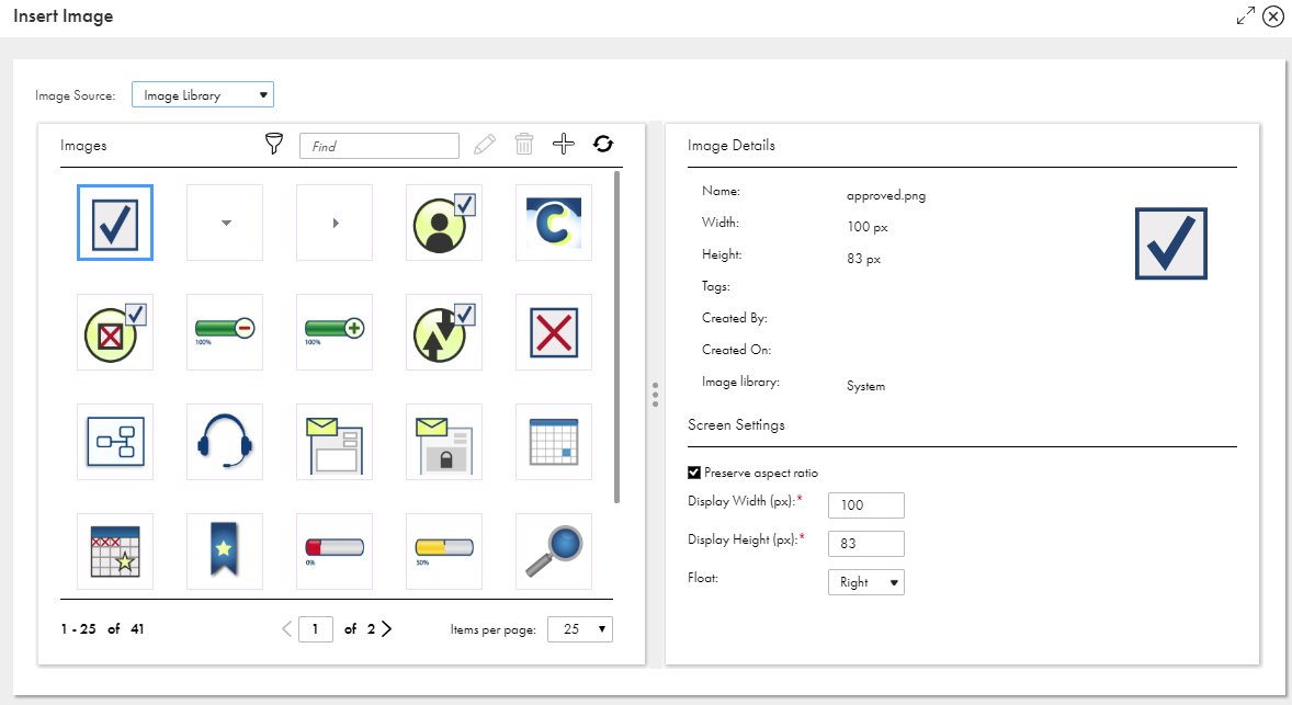
 (Insert/edit image) | If an image is not selected, press this button to insert a new image. To change an existing image or its properties, select the image before pressing this button. After pressing this button, Guide Designer displays the following dialog: The images you see in the top area were previously imported into Guide Designer using the Settings button located on the Design Home page. You can also upload an image for use in the current screen step. An image uploaded here is not available for use in other steps within this guide or in any other guide. You can also insert any image available on the web into the step. Do this by dragging it from the web site directly into the screen editor at the position at which you want to inset it. The fields within this dialog are: - - Search area: Use the left text box to search for an image using text that you typed either in the Title or Description fields. Use the right text box to type a tag that was used to label an image. As you type a tag's text, you will see tags that match what you are typing.
- - URL: If the is accessible using a URL, enter it here.
- - Title: A title for the image.
- - Description: Text that describes the image. Notice the text that was added to this dialog.
- - Width x Height: Use these fields to change the width and height of an image. You can either enter the size in pixels or enter a percent of the original size. The values you type can be less than or more than what the image's original dimensions were. If you only type a width and you entered pixels, the size is changed proportionally. For example, if you change the display width to 235 in the previous example, the display height will be 93 or 94 depending upon your browser. If you entered a percent value, that percent is also applied to the height.
- - Original W x H: The images width and height as it is stored.
- - Float: Use the options within this picklist to indicate the image's position in relation to where you inserted it. Your choices are None (it is displayed in line), Left (the image floats to the left), and Right (the image floats to the right).
- - Browse: Press this button to display a dialog that lets you select an image using your computer's file explorer. After you select and confirm your choice, the image will appear here.
|
 (Undo) | Eliminates the previously executed action. (Keyboard: Ctrl+Z) |
 (Redo) | If you have previously selected Undo, pressing this restores the change. (Keyboard: Ctrl+Y) |
 (Fullscreen) | Enlarges the size of the step so that it completely fills the area beneath the Guide Designer tabs. If you have already enlarged it, pressing this button restores the step to its original size. Note: You cannot insert fields into the step when the editor is in full screen mode. |
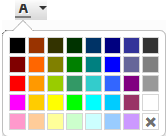 (Text color) | Pressing this button displays a pallette of colors that can be used when displaying text. If no text is selected, pressing this button and selecting a color changes the color of the text you type. If you move the cursor away from this text, the color is what exists at the cursor. Pressing this button and selecting a color while text is selected changes the color of the selected text. |
 (Background color) | Pressing this button displays a pallette of colors that can be used for coloring the background behind text. If no text is selected, pressing this button changes the background color of the text you type. If you move the cursor away from this text, the background color is what exists at the cursor. Pressing this button and selecting a color while text is selected changes the background color of the selected text. |
 (Find and replace) | Pressing this button tells Guide Designer to display a dialog into which you can type the text you wish to locate in the current screen. If you enter text in the Replace with field and press the Replace button, the selected text is replaced. If you select Replace all, all the text that can be found is replaced. |
 (Source code) | If text is being displayed, pressing this button tells Guide Designer to display the HTML that is being used to format the text in a different browser window, which is the HTML source editor. This button is not a toggle. After you finish making changes in the source editor, press its OK button. |
 (Show/hide more tools) | Adds a second row of screen editor buttons. If this second row is showing, pressing this button removes it. |
 (Font family) | Pressing this button displays a picklist of the fonts that can be used to display text. If no text is selected, pressing this button and selecting a font family changes the font of the text you type. If you move the cursor away from this text, the font will be what exists at the cursor. Pressing this button and selecting a font while text is selected changes the font of the selected text. |
 (Font size) | Pressing this button displays a picklist of the font sizes that can be used to display text. If no text is selected, pressing this button and selecting a size changes the size of the text you type. If you move the cursor away from this text, the font size is what exists at the cursor. Pressing this button and selecting a size while text is selected changes the size of the selected text. |
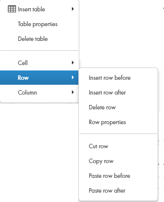
 (Table) | Pressing this button tells Guide Designer to display a picklist of table commands. Select Insert Table to display a grid of boxes. Use your mouse to select the number of rows and columns that will appear within the table. If the cursor is within a table, you can select other commands in this picklist. |
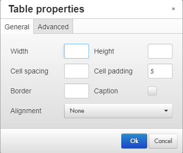
table properties | Selecting Table Properties within the picklist displays a dialog box with two tabs. Use this dialog to display the height and width of the table. (You should probably set the width as a percent -- use the percent symbol.) The height is seldom set. Cell spacing sets the space between table cell. Cell padding is the amount of space between a cell's contents and the cells edge. If you want a border, enter a number to indicate its width. If you want a caption to a table (this is not usual given the small size of the step's canvas), select this button. A small area above the table will appear. Finally, use the Alignment picklist to select None, Left, Center, or Right. None and Center are the most commonly used. The Advanced tab lets you set the table's style, and border and background colors. Select the Delete Table command to remove the table from the canvas. |
cell properties | If you select Cell from the Table picklist, a second picklist displays. Use this picklist to define cell properties, merge two cells together, or split cells that were merged. When defining cell properties, you can specify the cells width and height (normally, you wouldn't select a height), its type (Cell or Header), the Scope (None, Row, Column, Row group, or Column group) of what is changed, and the horizontal and vertical alignment of a cell's contents. |
row properties | If you select Row from the Table picklist, a second picklist displays. Row properties are similar to cell properties. Other commands in this picklist are self-explanatory |
 (Clear formatting) | If you've changed the way in which text displays, pressing this button tells the screen editor to remove your changes. |
(Align left) | Aligns currently selected paragraphs or the paragraph containing the cursor to the left margin. |
 (Align center) | Centers currently selected paragraphs or the paragraph containing the cursor within the left and right margins. |
(Align right) | Aligns current selected paragraphs or the paragraph containing the cursor to the right margin. |
 (Justify) | Adds spaces between words to lines in the currently selected paragraphs or the paragraph containing the cursor so that the text is justified; that is, all text is aligned to the left and right margins. |
 (Blockquote) | Changes the indent of selected paragraphs or the paragraph containing the cursor. If the paragraphs are already within a blockquote, this restores the original margin. |