Creating and Editing Steps
The following sections contain information on creating and editing the different kinds of steps.
Step Common Features
The individual steps you can add to a guide or process determine the execution path and options.
Every step has a title, which displays in the canvas as you design a guide or process.
For screen steps, the title is the prompt. Choose a title that helps the user understand the purpose of the step.
The way in which you set the data used in a step is by setting its source to a content, field, screen, query, or formula.
As you create a step, press Preview to review how Process Designer displays the current step.
Guide Screen Editor
The screen editor lets you add instructions and fields to a screen that displays in a guide.
The toolbar contains commonly used editing commands. If you press the

button (
Show/Hide More Tools) at the right edge of the toolbar, Process Designer displays additional options.
The Insert Read-Only Field and Insert Field for Update lists are described in the Field Picklists topic.
The screen editing options are:
Button | Description |
|---|
 (Bold) | Sets selected text to bold or indicates that the text you are about to type will be bold. If you press this button when bold text is selected, the bolding is removed. (Keyboard: Ctrl+B) |
 (Italic) | Sets selected text to italic or indicates that the text you are about to type will be italic. If you press this button when italic text is selected, the italic is removed. (Keyboard: Ctrl+I) |
 (Underline) | Underlines selected text or indicates that the text you are about to type will be underlined. If you press this button when underlined text is selected, the underlining is removed. (Keyboard: Ctrl+U) |
 (Bullet list) | If the current paragraph does not have a bullet, adds a bullet and changes the paragraph's indent. If the paragraph has a bullet, this command removes the bullet and removes a level of indenting. When you press Enter within or at the end of a paragraph, the next paragraph also has a bullet. To end the bullet list, either type two returns or reselect this icon. |
 (Numbered list) | If the current paragraph does not have a number, adds a number and changes the paragraph's indent. If the paragraph has a number, this command removes the number and removes a level of indenting. If the preceding paragraph is part of a numbered list, selecting this command adds it to that list. When you press Enter within or at the end of a paragraph, the next paragraph also has a number. To end the numbered list, either type two returns or reselect this icon. |
 (Decrease indent) | If the current paragraph or selected paragraphs are indented, it removes a level of indenting. |
 (Increase indent) | Adds a level of indenting to the current paragraph or to selected paragraphs. |
 (Insert/edit link) | Changes the selected text into a link. After you select this button, Process Designer displays the following dialog: The files in this dialog are: - - URL: Where you type a Web address.
- - Text tp display: If you wish text to display instead of the URL, type that text here.
- - Title: Text that appears when a user moves the cursor over the link. (This text may not appear in all browsers.)
- - Target: Select New Window from this picklist to display the link in a new window. If you do not change this from None, the URL appears in the current window.
If you press this button while your cursor is anywhere in a link, you can edit the link's information. If you forget to select text, the link will not display. However, it will be created. Correct this by pressing the <> button to locate the link. If you know HTML, you can edit the link directly. If you do not, just delete it. (An empty link's text is similar to "<a href=""><a>".) |
 (Remove link) | Removes a previously created link. Your cursor can be anywhere within the link. The text in the "Text to display" field remains after you select this button. |
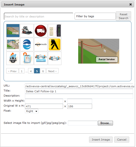
 (Insert/edit image) | If an image is not selected, press this button to insert a new image. To change an existing image or its properties, select the image before pressing this button. After pressing this button, Process Designer displays the following dialog: The images you see in the top area were previously imported into Process Designer using the Settings button located on the Design Home page. See the Process Central help for information on settings..You can also upload an image for use in the current screen step. An image uploaded here is not available for use in other steps within this guide or in any other guide. You can also insert any image available on the web into the step. Do this by dragging it from the web site directly into the screen editor at the position at which you want to inset it. The fields within this dialog are: - - Search area: Use the left text box to search for an image using text that you typed either in the Title or Description fields. Use the right text box to type a tag that was used to label an image. As you type a tag's text, you will see tags that match what you are typing.
- - URL: If the is accessible using a URL, enter it here.
- - Title: A title for the image.
- - Description: Text that describes the image. Notice the text that was added to this dialog.
- - Width x Height: Use these fields to change the width and height of an image. You can either enter the size in pixels or enter a percent of the original size. The values you type can be less than or more than what the image's original dimensions were. If you only type a width and you entered pixels, the size is changed proportionally. For example, if you change the display width to 235 in the previous example, the display height will be 93 or 94 depending upon your browser. If you entered a percent value, that percent is also applied to the height.
- - Original W x H: The images width and height as it is stored.
- - Float: Use the options within this picklist to indicate the image's position in relation to where you inserted it. Your choices are None (it is displayed in line), Left (the image floats to the left), and Right (the image floats to the right).
- - Browse: Press this button to display a dialog that lets you select an image using your computer's file explorer. After you select and confirm your choice, the image will appear here.
|
 (Undo) | Eliminates the previously executed action. (Keyboard: Ctrl+Z) |
 (Redo) | If you have previously selected Undo, pressing this restores the change. (Keyboard: Ctrl+Y) |
 (Fullscreen) | Enlarges the size of the step so that it completely fills the area beneath the Process Designer tabs. If you have already enlarged it, pressing this button restores the step to its original size. Note: You cannot insert fields into the step when the editor is in full screen mode. |
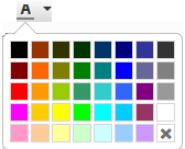 (Text color) | Pressing this button displays a pallette of colors that can be used when displaying text. If no text is selected, pressing this button and selecting a color changes the color of the text you type. If you move the cursor away from this text, the color is what exists at the cursor. Pressing this button and selecting a color while text is selected changes the color of the selected text. |
 (Background color) | Pressing this button displays a pallette of colors that can be used for coloring the background behind text. If no text is selected, pressing this button changes the background color of the text you type. If you move the cursor away from this text, the background color is what exists at the cursor. Pressing this button and selecting a color while text is selected changes the background color of the selected text. |
 (Find and replace) | Pressing this button tells Process Designer to display a dialog into which you can type the text you wish to locate in the current screen. Use the Process Designer's Find Step command to search for text in all of the guide's steps. If you enter text in the Replace with field and press the Replace button, the selected text is replaced. If you select Replace all, all the text that can be found is replaced. |
 (Source code) | If text is being displayed, pressing this button tells Process Designer to display the HTML that is being used to format the text in a different browser window, which is the HTML source editor. This button is not a toggle. After you finish making changes in the source editor, press its OK button. |
 (Show/hide more tools) | Adds a second row of screen editor buttons. If this second row is showing, pressing this button removes it. |
 (Font family) | Pressing this button displays a picklist of the fonts that can be used to display text. If no text is selected, pressing this button and selecting a font family changes the font of the text you type. If you move the cursor away from this text, the font will be what exists at the cursor. Pressing this button and selecting a font while text is selected changes the font of the selected text. |
 (Font size) | Pressing this button displays a picklist of the font sizes that can be used to display text. If no text is selected, pressing this button and selecting a size changes the size of the text you type. If you move the cursor away from this text, the font size is what exists at the cursor. Pressing this button and selecting a size while text is selected changes the size of the selected text. |
 (Table) | Pressing this button tells Process Designer to display a picklist of table commands. Select Insert Table to display a grid of boxes. Use your mouse to select the number of rows and columns that will appear within the table. If the cursor is within a table, you can select other commands in this picklist. |
table properties | Selecting Table Properties within the picklist displays a dialog box with two tabs. Use this dialog to display the height and width of the table. (You should probably set the width as a percent -- use the percent symbol.) The height is seldom set. Cell spacing sets the space between table cell. Cell padding is the amount of space between a cell's contents and the cells edge. If you want a border, enter a number to indicate its width. If you want a caption to a table (this is not usual given the small size of the step's canvas), select this button. A small area above the table will appear. Finally, use the Alignment picklist to select None, Left, Center, or Right. None and Center are the most commonly used. The Advanced tab lets you set the table's style, and border and background colors. Select the Delete Table command to remove the table from the canvas. |
cell properties | If you select Cell from the Table picklist, a second picklist displays. Use this picklist to define cell properties, merge two cells together, or split cells that were merged. When defining cell properties, you can specify the cells width and height (normally, you wouldn't select a height), its type (Cell or Header), the Scope (None, Row, Column, Row group, or Column group) of what is changed, and the horizontal and vertical alignment of a cell's contents. |
row properties | If you select Row from the Table picklist, a second picklist displays. Row properties are similar to cell properties. Other commands in this picklist are self-explanatory |
 (Clear formatting) | If you've changed the way in which text displays, pressing this button tells the screen editor to remove your changes. |
(Align left) | Aligns currently selected paragraphs or the paragraph containing the cursor to the left margin. |
 (Align center) | Centers currently selected paragraphs or the paragraph containing the cursor within the left and right margins. |
(Align right) | Aligns current selected paragraphs or the paragraph containing the cursor to the right margin. |
 (Justify) | Adds spaces between words to lines in the currently selected paragraphs or the paragraph containing the cursor so that the text is justified; that is, all text is aligned to the left and right margins. |
 (Blockquote) | Changes the indent of selected paragraphs or the paragraph containing the cursor. If the paragraphs are already within a blockquote, this restores the original margin. |
Service Call Step
Guides need not be self-contained. Most guides embed externally created sets of actions, as follows:
- •Service Calls. To make a call to specific actions from within the current guide.
- •Embedded Guides. To place an embedded guide within the current guide.
- •Process Calls. To place a process or subprocess within the current guide.
Note: Service calls are often specific to the object selected in the Properties dialog, so you may not see it. In addition, there are objects that are unique to one object and only appear when that object is selected. For example, if the guide is being applied to a Salesforce lead, you will see a Create Lead service call action.
You define Service Call steps for tasks that can be automatically executed. You can define them within Process Designer or access those available in services and systems integrated with Process Designer, such as Salesforce.
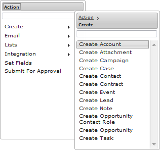
You can see both built-in actions and those added for applications and services categorized within the Action list. For example, the Create category shown here references several actions, including Create Account:
The actions listed are specific to your organization. However, you can usually find the built-in actions in the Advanced, Lists, and Integration categories. Some of the built-in actions are available only if you are licensed to use the Salesforce connector.
Drill down to see available actions using the right arrows.
The Action list also contains a list of Processes if you have published a process in Process Designer, similar to how service connectors are accessible in a process. The list shows the name of each process available to the Service Call step. If the process also exposes events, the event names appear in the list.
Tabs
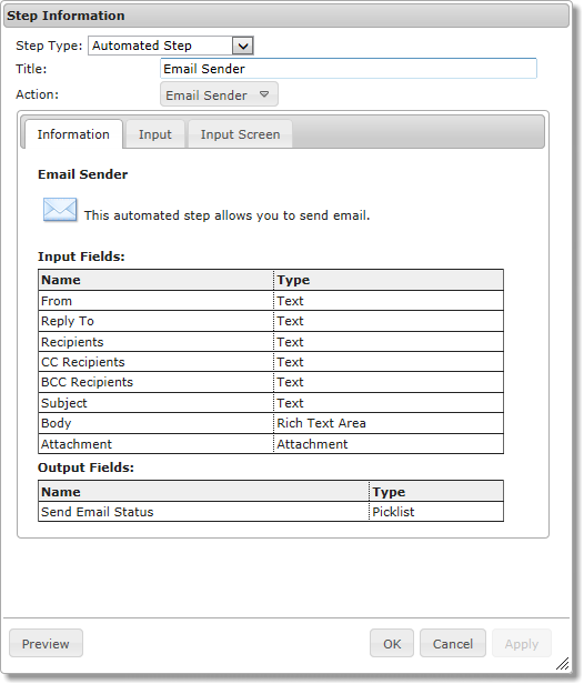
May step types include three basic tabs, Information, Input, and Input Screen. The following image shows the tabs in a Service Call step:
Information Tab
The Information tab has a description of the Service Call step and a description of the input and output fields for the step. The descriptions in this tab can help you when you are using the object's input or output fields. Because this information is automatically generated, only input and output field names and types appear in this tab. There are no descriptions for them.
Note: The information tab, depending upon the object the step is operating upon, lets you choose to Run on a single object or Run on each object in list until either the list ends or until an outcome occurs.
Selecting "Run on a single object" tells Process designer that it will only be applying a service call or a subprocess on one object. It the other option is selected, the step operates on each object in an object list. If this option is selected, it is indicated in the canvas with a looping arrow button. Clicking on this buttons opens the invoked step.
Input Tab
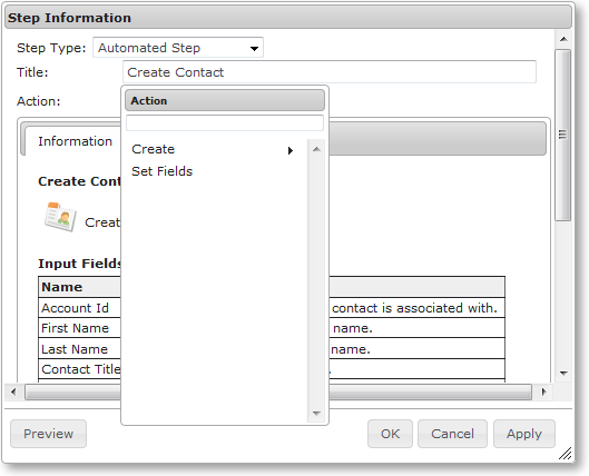
The Input tab shows the names of input fields that are most often used when using this kind of step. For Service Call steps that create objects, the input fields shown are the fields that are most frequently needed when the object is created. (If you do not need a field and it is optional, you can delete it.) You can choose additional (optional) input fields from the list. For example:
Use the

delete icon to remove a field. This removes input fields that you do not want to pass to the Service Call step. The names of required fields are displayed with an asterisk. These fields cannot be deleted.
Use the Add Input list to add additional input fields (or re-add input fields that were accidentally deleted). The source for the field's data is obtained by selecting Constant, Field, Screen, Query, or Formula in the list following the field's name. (Not all of these always appear.)
The fields shown in the Add Input list are more than just those than are shown in the Information tab as it contains all fields within the currently selected object and includes the fields that were declared within the properties.
After a step executes, all steps that follow can access output fields created in the step upstream. This enables you to use the screen editor to insert them into the step's canvas.
Input Screen Tab
Note: The Input Screen tab is only available for guides.
If you select Screen as the source of the input field source, you must place that field on a screen using the Input Screen tab. For example:
When users see this step, they will see three places in which they can enter information.
To add an input field to the screen editor, click on it. The editor adds input field names as a label followed by an input area for the type of data being requested; for example, a text entry field or a picklist.
Hint: You can make what you enter more readable if you align text and fields.
Here are a few things you should know:
- •Because the input fields are being added to the editing screen, you can add instructions and comments and rearrange the way the screen appears.
- •Notice the Insert Read-Only Field picklist. Use a read-only field to display information that will help the user or present object information. For example, you can display the name of the user who is running the guide (using the "Current User" field) at the top of a screen that is asking for the information needed for creating a new Event.
- •You can double click within any input field placed on the screen to display the Field Properties dialog.
- •Use the "Don't allow skip/Allow Skip Button" picklist to define whether the guide's user can go to the next step without performing any of the step's activities. The following figure illustrates each of these behaviors.
If you select "Don't allow skip", the user must perform the actions indicated within the step. Because this action is required, only one possible action can follow, which is that Guide Designer executes the next step. In contrast, if you select "Allow Skip Button", there are two possible answers: one if the user performs the action and the other when no actions are performed. Because the action is optional, Guide Designer displays a button that the user can press to skip the step. While the default text for the button is "Skip", you can change it by entering text within the data entry area displays that displays after you select "Allow Skip Button."
Events Tab
On the Events tab, you can set timers that determine when the action occurs, and also specify Messages for use with message providers and correlation.
In the previous image, two timers were added. The top shows "After". Here you are specifying a duration; that is, the timer event occurs after the amount of time selected expires. In contrast, the bottom timer event occurs at the time you specify and you can also specify the number of days. Both of these timers are non-interrupting, which means each branch executes separately from other branches. This mode of executing is similar to a Parallel paths step that does not converge to a common step after the branch ends its execution. The difference is that if the timer branch branches do not execute if the non-timer step concludes.
Stated in another way, the timer interrupts the step upon which the timer is set and the timer's path executes.
If you had created interrupting timers, the branches merge back together. Here's an example:
A step can have both interrupting and non-interrupting timers, as the following shows:
Here are some usage notes:
- •To add a timer, press the Add Timer button.
- •To delete a timer, press the "x" button.
- •To reorder the branches, press the Reorder button. This displays a dialog box that lets you change the way branches display in the canvas. The order in which the branches display has no effect on the order in which branches execute.
Note: Process Designer cannot interrupt a subprocess invoked in the agent from a process executing in Informatica Cloud. An interruption only occurs if all processes are executing in the agent or in the cloud.
Email Actions
Note: This action is not always available.
If email actions can be performed, you may see a Service Call step that looks something like this:
For information on using email, refer to the Sample Orchestration project. After creating the project, review the objects in the Email and URL Links Demo.gt.xml guide as well as EmailSender.bpel file.
Create Step
Use the Create step to add new object instances. For example, if you work with an Account object, you can use the Create step to add a new account.
The following image shows a Create step for the Account object:
To create new objects:
- 1. Choose the Input Fields tab and select all the fields that you will be adding to the object. Some are required; others are optional.
- 2. For each field name, set its source to one of the following values: Content, Field, or Formula.
Using Reference Fields
Note that:
- •If you do not include a reference field on the Input Fields tab for the object you are creating, Process Designer uses the value of the current object at runtime.
- •Reference fields for the Applies To object are set if they are not set explicitly in the Input tab.
- •When the content of a reference field is set to empty, it is not included in the create statement. (This prevents problems that might occur when explicitly setting a field to empty or null could violate data constraints.)
Output Checkpoint Action
Use the Output Checkpoint action to write a checkpoint. This action only exists when your application is using a WS-Human Task BPEL process. Normally, the changes a guide makes to objects are not visible until the guide concludes. Executing an Output Checkpoint Service Call step makes these changes available to any other process that has access to the information.
Reassign Action
Use the Reassign action to reassign the current object to another user. Typically, only one field, a user name, need be used in this kind of step. However, your application may require more.
Set Fields Action
Note: This action is deprecated. Use an Assignment step instead.
The Set Fields action can set the value of any field that is available to the guide. The primary fields (those shown first in the Add Input picklist) are those from the Applies To object's fields. The picklist may also include:
- •Types of objects related to this one
- •Field's defined in the Guide Fields tab within the Guide Properties dialog
- •A Service Call step output fields (these are defined in the application)
Data Decision Steps
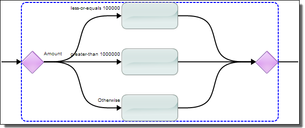
A decision step allows a guide to take different paths depending on the value of some field. Here's an example that shows a Data Decision step having three choices:
The first two paths are tests that the step performs acting upon the value of the Annual Revenue field. These tests compare the value against the data in the step. If a condition is met, the execution path proceeds on the associated branch.
For each data decision path you add, a branch is added to the canvas. For example, this shows the two conditions and the "Otherwise" path:
Each branch can have as many steps as you need. After you select the step type, a new empty step is added. Simply delete any unused steps.
You can jump to any of the steps within a Data Decision from another step.
You can rearrange the order in which a path displays in the canvas by dragging it to a new position.
A Data Decision step always has an Otherwise path. This path handles execution if none of the data meets the conditions in your explicit tests.
Evaluating Paths
Conditions in a data decision step are evaluated in a straightforward manner based on the criteria you specify
While there is no limit to the number of paths but you should use as few as possible to minimize complexity.
A Data Decision step can lead to another decision step. For example, the top branch in the next figure executes if the annual revenue is less than or equal to 100,000. The second decision tests if the city is Boston. If the value is less than or equal to 100,000 and the city is not Boston, execution goes the untitled step.
Using this technique, you can support Boolean AND logic by putting the test for the second condition on the true branch of the first condition. The condition to be met in the top branch of the previous figure is "Annual Revenue is less or equal to 100,000 AND the city is Boston".
Similarly, you can support Boolean OR logic by adding a test for the second condition on any of the branches.
Remember that the order in which you declare tests is important. For example, you might have a test for a value less than 100 and another that looks for a value less than 10. If the value is 8, both tests would be true. However, if the less than 100 test executes first, the second condition would never be evaluated.
Data Decision Tests
The tests that you can apply to numeric values are:
- •Equals
- •Not equal to
- •Less than
- •Less or equal
- •Greater than
- •Greater or equal
- •Is set
- •Is unset
These selections have their usual meaning. However, "is set" and "is unset" can also mean "exists" and "does not exist.
For text, your choices are:
- •Custom Answers: Contains: Enter one or more strings that test true if they are in the field. If there is more than one string that can be tested for an answer, separate each with a comma. This means that the text you are looking for cannot contain a comma. For example, "Boston, MA" is true if the text contains either "Boston" or "MA". Notice that "Springfield, MA" also matches as "MA" is one of the match conditions. If the field's value is restricted (for example, the answers are predefined), those choices appear in a list as shown here:
- •Custom Answers: equals: The text in the test completely matches the text in the field.
Compare this with the "Contains" choices. Here, you can choose only one item from a list so each path has its own branch. In contrast, you can choose more than one item if you choose "Contains". (Select multiple items by clicking on the first item, then using Ctrl-click for all others.)
In this example, the user's choices are constrained.
- •Custom Answers: Starts with: The items all begin with the characters you enter.
- •Custom Answers: Ends with: The items all end with the characters you enter.
- •Custom Answer: Starts with any of: Type a comma-separated list of what the step should match. For example, if you select a first name field, you might enter "Bar, Bil". This would match Barry, Barbara, or Bill. The text you type here is case sensitive; that is, if you type "bar", no match occurs if the name is "Barney".
- •Answer per choice: If the data could be displayed as a list or all possible values for the field are defined in the object (for example, predefined lead sources), choose this option to create one path for each possible choice.
After confirming your settings, a new branch is added for each answer. Continuing with this example, it would create 12 branches.
When the guide executes, users see a step that contains a button for each branch.
If the field that you choose is a multi-select list, the available options display so you can select one or more.
Reordering Tests
To change the order of your paths, select Reorder. You can now use the up and down arrows to reorder the paths.
Sometimes, the order in which you test is important and it might not be immediately obvious. For example, assume that address contains the city and state. A test such as "address contains any of Boston" is more specific than "address contains any of MA" and should be the first path.
A second reason might be that you would like the branches to appear in some order on the screen. For example, you may want the most used branch to always be on top.
Embedded Guide Step
Guides need not be self-contained. Most guides, actually, embed externally created sets of actions, as follows:
- •Embedded guides. Another separate guide is placed within the current guide.
An Embedded Guide step places one guide within another guide, and that guide runs when a user executes that step. This means that the steps defined in one guide (the embedded guide) are executed within another (the embedding guide). Embedding one guide in another is one of the more powerful and useful features within Process Designer.
- •Process Calls. The actions defined in a process or subprocess are placed within the current guide. See the help on the Process Call or Subprocess steps for more information.
- •Service Calls. The actions defined in a service are placed within the current guide. See the help on the Service Call step for more information..
End/Milestone Step
The End/Milestone step marks the end of a guide's execution or a milestone. A milestone generally indicates the end of one phase in a guide's activities. You select the function to be performed by selecting the Ending Type, which is either End of Guide or Milestone: End of Current User's Work.
Note: You can make the text that you enter more readable if you insert text and fields into a table.
End Milestone End of Guide
An End of Guide step marks the place where a guide finishes executing. Every branch in a guide concludes with an End of Guide step (unless it is a Jump Step). An End of Guide step can (and usually does) specify an outcome. For example, here is a filled-in Possible Outcomes tab within a Guide Properties dialog.
This declares that when this guide concludes, it should have one these four outcomes. (More can be added within this step, as is described later in this topic.)
There can be and usually are more branches than End of Guide steps. This occurs when more than one branch has the same outcome. Here is a part of a guide where two end steps have one conclusion, two have another, and just one has a unique outcome:
Use the Outcome picklist to set the branch's outcome. Here is an example:
Here, Nurture is selected. The Outcome picklist contains all of the outcomes you declared within the Guide Properties dialog. If the outcome has not yet been added, you can add it by clicking on Add new outcome (at the bottom of the picklist). After you create a new outcome, the Guide Designer shows it on remaining outcome picklists and also adds it to the Outcomes tab in the Guide Properties dialog.
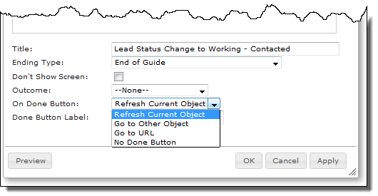
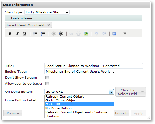
When the executing guide reaches an End of Guide step, Guide Designer performs the action you set using the On Done Button picklist.
If you want the final action of the guide to be to take the user to another object or to a URL instead of displaying this step, you can bypass it being displayed by checking Don't Show Screen. This means that the last step the user sees is one where there is an interaction. If previous steps are either Service Call or Process Call steps, for example, the user's interaction will appear to end after that step.
Note: A browser's popup blocker must be shut off before this feature is used. On mobile guides, "Refresh Current Object" is ignored.
End Milestone Milestone
A Milestone step is a place that has significance. For example, the guide is handed off to another user. In most cases, users running the guide see a screen having a Done button. Clicking the button can perform the same actions as those performed when the user presses a Done button in an End of Guide step (as well as a few additional ones) but the guide isn't really done. When the guide is next run (possibly by someone else other than the original user), it continue from the step that follows the milestone step.
Note: In some cases, you may simply be using a milestone stop to record an event that occured and the guide will automatically continue to the next step.
Here is what a Milestone step looks like:
Milestones are especially useful when a user hands off work to someone else. (If the guide is handed off, the user who will be handing the guide off should let the next user know that something needs to be done. This may be built into your application's workflow rules.) When that user starts the guide, it starts at the step following the milestone. Milestones should also be used if the user normally stops executing the guide at a step to do something else.
After a guide hits a milestone, further activities do not need to occur. However, the guide will be terminated if no further actions occur within 14 days. Non-milestone guides are terminated in 7 days. Once action begins after a milestone is reached, the guide will be terminated if it does not either end or reach another milestone in 7 days.
The fields within this dialog are:
Jump Step
When creating a guide or process, one set of choices might require some activities and a branch would occur. After these activities are completed, the flow of steps should rejoin the actions of another branch.
For example, a guide that leads a sales rep through a conversation with a prospect could take many different branches as the rep talks about features and overcomes objectives. However, at some point in some of these branches, the rep should schedule a meeting. The scheduling step and the steps that follow may be same. Rather than add a scheduling step to each branch that needs one, you could instead jump to a scheduling step that has the scheduling steps.
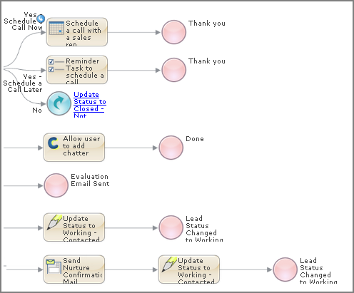
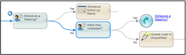
A Jump Step is exactly what it sounds like. In the following illustration, the "Were they interested?" step has two branches, "Yes" and "No". This "Yes" branch leads to a Jump Step that tells the process to move to and execute the "Schedule a Meeting?" step.
Unlike embedded steps or service call steps, a jump step changes the execution path.
Note: Jumps within a Parallel Path have the limitation that the jump can only occur within the same branch; that is, you cannot jump out of the Parallel Path nor can you jump to another branch. You can jump from one branch to another within a Decision step.
A Jump step is displayed as a circle with a rounded arrow in it. To the right of the circle is the name of the step to which the step will jump. This name is also a link. When you click on it, the step that is the target of the jump is displayed and selected.
The target of the jump has a small rounded arrow at its upper left corner. In the previous figure, notice the arrow points into the step for the target of the jump while the arrow of the jump step points away from it. This little arrow lets you know that the step is also executed from another step in addition to being executed normally within the branch.
If more than one step jumps to the same target step, you can hover over the small arrow to see how many jump steps have this step as their target. If you click on the jumped to arrow, the editor displays a dialog showing all of the steps jumping to it.
To create a Jump step, simply choose the Jump Step type and, from the To list, select the step to which you want to change the execution path.
Screen Step
A Screen step has two primary functions:
- •Displays instructions telling the user about what is being displayed, what to enter, and so on.
- •Updates an object's data based on user input.
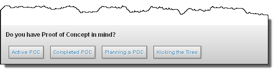
Here is a step that presents what a sales rep would say to a prospect:
This screen shows the sales rep a question that should be asked. At the bottom of the screen, the rep sees the text entered in the Prompt field and a button for each of four possible answers:
After creating a Screen step, Process Designer creates a branch for each answer. In the following image, the guide has three answers. Initially, the branches converge at the diamond:
More typical guides take each branch and add steps to it. In the following image, two steps flow into an End step and one proceeds to a Jump step:
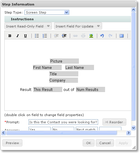
The following figure shows a Screen step with some data added to its canvas. Two lists appear in the editor: Insert Read-Only Field and Insert Field for Update. Each contains fields that Process Designer can display when it executes the step. An updateable field shows the current value of a field on the screen. However, users can modify this value. When users modify an updateable field, the new value is stored into your application as soon as they click on any of the Answer buttons. Here's an example containing seven read-only fields:
Updateable fields can be displayed as a box into which users type text.
You can click within a field's text box to display and edit the field properties.
You can use the Reorder button at the bottom of the dialog to change the order in which the screen editor displays branches. Sometimes, rearranging the order can make the step's action clearer.