Scorecard Dashboard in Informatica Analyst
The Scorecards workspace in Informatica Analyst displays the scorecard dashboard. In the scorecard dashboard, you can view the data objects with scorecards, scorecard run trend for the past six months, scorecards in a project, an aggregate of good, acceptable, and unacceptable metrics for all the scorecard runs in a month, and the assets list pane.
The scorecard dashboard on your machine is not refreshed automatically when the scorecards are modified by other users. Use the F5 function key or toggle between workspaces or scorecard result tabs to refresh the scorecard dashboard.
You can view the data as a data series or as data points in the panes. The data points appear as small opaque circles and the data series appears as horizontal bars, vertical bars, or slices in the charts.
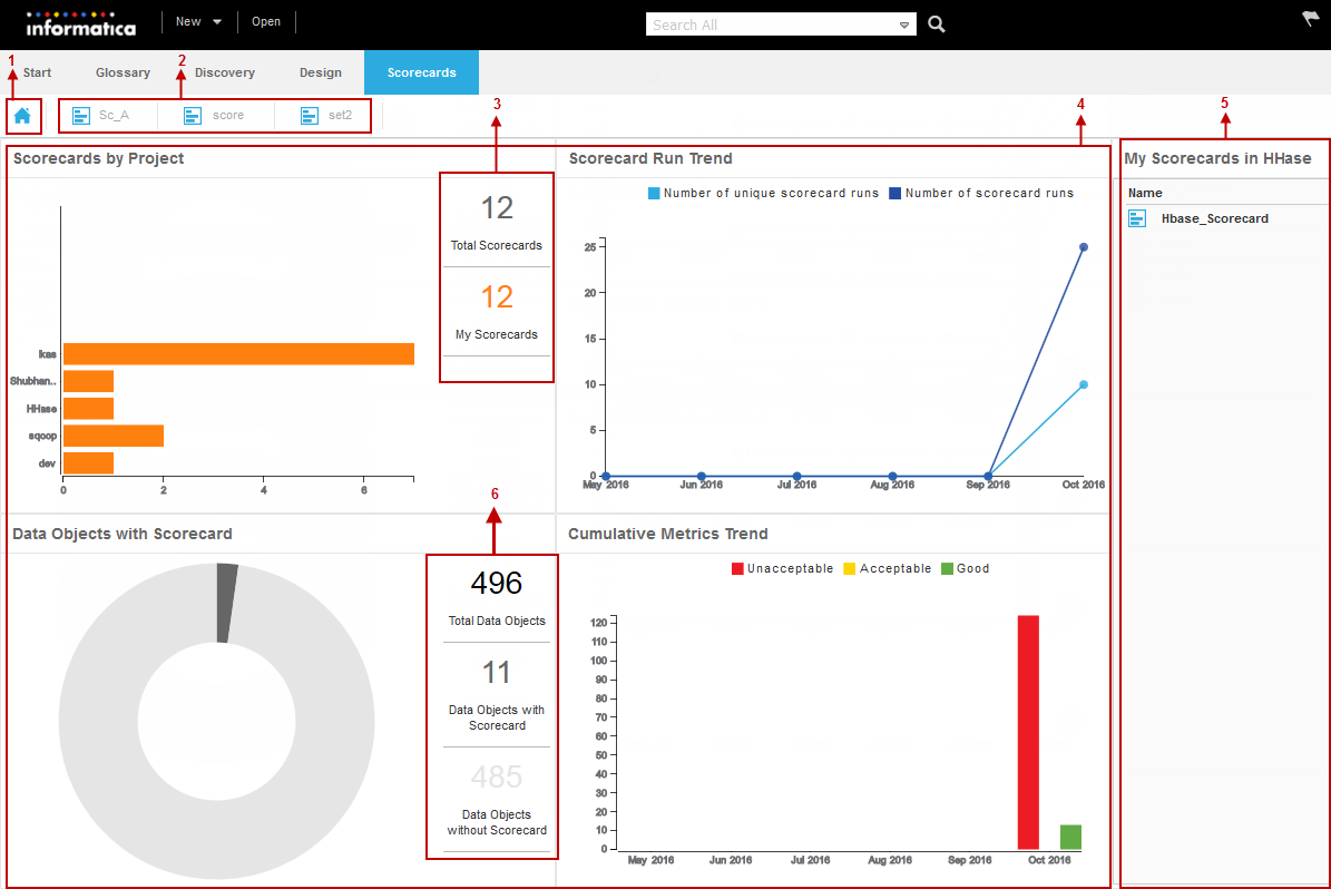
The following image shows the scorecard dashboard and the assets pane in the Scorecards workspace:
- 1. Scorecard dashboard icon. Displays the scorecard dashboard.
- 2. Scorecard result tabs. Displays the scorecard results for the open scorecards.
- 3. Legend in the Scorecards by Project pane. Displays the total number of scorecards in all the projects and the total number of scorecards that you have read access to in all the projects.
- 4. Scorecard dashboard. Displays the scorecards by project, scorecard run trend, data objects with scorecard, and cumulative metrics trend panes in the dashboard.
- 5. Assets list pane. Displays the list of scorecards or data objects associated with a legend, data series, or data point in the chart.
- 6. Legend in the Data Objects with Scorecard pane. Displays the total number of data objects, number of data objects with scorecards, and the number of data objects without scorecards
After you click a data point or data series in the scorecard dashboard, the scorecards that map to the data point or data series appear in the assets list pane. After you click a scorecard in the assets list pane, the scorecard results appear in a tab in the Scorecards workspace. The assets lists pane displays the scorecards for which you have read access.
Scorecards by Project
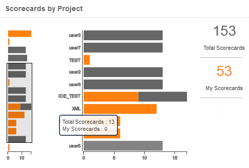
The Scorecards by Project pane displays the projects in the Model repository along with the number of scorecards in each project as a bar chart. A bar in the bar chart represents a project. The x-axis in the chart displays the number of scorecards and the y-axis displays the projects that has scorecards.
The scorecards in a project appear in Grey color in the bar chart and the scorecards that you have read access to appears in Orange color in the bar chart. The Total Scorecards section in the legend displays the total number of scorecards in the Model repository. The My Scorecards section in the legend displays the number of scorecards that you have read access to in the Model repository.
The following image shows the Scorecards by Project pane in the scorecard dashboard:

You can view the following charts in the pane:
- •Detailed chart. Displays all the projects in the Model repository with scorecards and the number of scorecards in each project. If the number of projects is greater than 10, the Scorecards by Project pane displays a slider.
- •Miniature chart. Displays all the projects and the number of scorecards in each project within the slider in the detailed chart.
When you move the pointer over the miniature chart, the total number of scorecards and the number of scorecards that you have access to in a project appears in a data label.
To view the scorecards in a project for which you have read access to, click the Orange part of the horizontal bar. To view all the scorecards for which you have read access to in the Model repository, click My Scorecards in the bar chart. The scorecards appear in the assets list pane. Click a scorecard in the assets pane to view the scorecard results.
Scorecard Run Trend
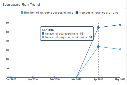
The Scorecard Run Trend pane displays the scorecard run trend for the current month and the past five months as line charts with markers. The x-axis in the chart displays the current month and the past five months and the y-axis displays the number of scorecards. A marker is a data point in the line chart. When you move the pointer over a marker in the chart, the scorecard run summary for the month appears in a data label.
You can view the following markers in the pane:
- •Number of scorecard runs. The marker displays the total number of scorecard runs in the month.
- •Number of unique scorecard runs. The marker displays the total number of unique scorecard runs in the month.
The following image shows the Scorecard Run Trend pane in the scorecard dashboard:

When you click a marker in the pane, the scorecards that map to the marker appear in the assets list pane. You can view the scorecards for which you have read access. Click a scorecard in the assets list pane to view the scorecard results in the Scorecards workspace.
Data Objects with Scorecards
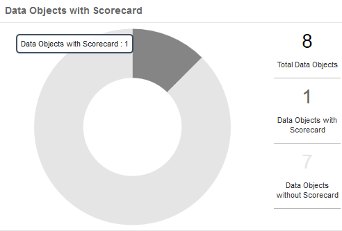
The Data Objects with Scorecards pane displays a doughnut chart. You can view the number of data objects with scorecards and the number of data objects without scorecards as slices in the chart.
When you move the pointer over the doughnut chart, the data that map to the slice appears in a data label.
The following image shows Data Objects with Scorecards pane in the scorecard dashboard:

The legend in the Data Objects with Scorecards pane displays the following data statistics:
- •Total Data Objects. Displays the total number of data objects in the Data Object folder in the Assets pane in the Library workspace. The data objects includes logical data objects and customised data objects.
- •Data Objects with Scorecard. Displays the number of data objects with scorecards.
- •Data Objects without Scorecard. Displays the number of data objects without scorecards.
After you click the slices in the doughnut chart or the Data Objects with Scorecard and Data Objects without Scorecard legend, the scorecards that map to the slice in the doughnut chart or the legend appear in the assets list pane.
Cumulative Metrics Trend
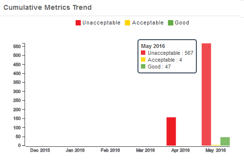
The Cumulative Metrics Trend pane displays column charts. You can view the aggregate of good, acceptable, and unacceptable metrics for all the scorecard runs in a month in the chart as vertical bars. You can use the Cumulative Metrics Trend pane to view and analyze the metrics trend for the current month and the past five months.
When you move the pointer over a vertical bar, the metric summary for the month appears in a data label. When you click a vertical bar in the pane, the relevant scorecards appear in the assets list pane. You can view the scorecards for which you have read access. Click a scorecard in the assets list pane to view the scorecard results.
The following image shows the Cumulative Metrics Trend pane in the scorecard dashboard:

The assets list pane might display a few scorecards in the unacceptable metric list and good metric list when the scorecard trend changes with time in a month. To analyze the metrics, open the scorecard to view the scorecard results.
Example 4. Example
You are the regional manager for a string of retail stores in the state of California. You create the Sales_SC scorecard on the Sales table.
You set the following thresholds for the Sales_amt metric in the Sales_SC scorecard:
- •Unacceptable = 0% to 40%
- •Acceptable = 41% to 89%
- •Good = 90% to 100%
To capture the sales data on a daily basis, you use the scheduler service to run the scorecards every night on the Sales table. You prepare a monthly report for the management for the month of May and you use the scorecard dashboard to verify your report. For the month of May, when you click the vertical bars for Unacceptable metrics and Good metrics in the chart, the Sales_SC scorecard appears in the assets list pane.
When you analyse the sales across the month, you find the following trend:
- 1. From 1st May through 25th May, the Sales_amt metric is computed below 40% and is marked as an unacceptable metric.
- 2. In the last week of May, due to a rise in sales, the Sales_amt metric is computed above 98% and is marked as a good metric.
