Trend Charts
Use trend charts to monitor how the metric scores and cost of invalid data in metrics change over a period of time.
The trend charts contain both score and cost graphs that plot the score or cost values in the vertical axis against all the scorecard runs in the horizontal axis. By default, the trend chart shows data from the last 10 scorecard runs. You can view the number of total rows and invalid rows for the metric in the trend chart. The trend chart also displays whether the score and cost trends remained constant or moved up or down based on the last scorecard run.
The Analyst tool uses the historical scorecard run data for each date and latest valid score values to calculate the score. The Analyst tool uses the latest threshold settings in the chart to depict the color of the score points. You can view the Good, Acceptable, and Unacceptable thresholds for the score. The thresholds change each time you run the scorecard after editing the values for scores in the scorecard. When you export a scorecard, the Analyst tool includes the trend chart information including the score and cost information in the exported file.
Score Trend Chart
A score trend chart is a graphical representation of how the metric scores change over multiple profile runs. The score trend chart plots the metric score values in the vertical axis against all the scorecard runs in the horizontal axis.
The following image shows a sample score trend chart:
Example
As a data analyst, you can monitor the data quality to analyze whether the mappings and other process changes result in increasing the data quality score. After you measure the change in data quality, you can report back the data quality change for the organization to analyze and use. For example, at the end of multiple scorecard runs, the percentage of valid values in a Social Security number column might have moved from 84 to 90. You can report this change in data quality as a visual chart for a quick analysis.
Cost Trend Chart
A cost trend chart is a graphical representation of how the cost of invalid data in metrics change over multiple profile runs. The cost trend chart can measure the impact of data quality in an organization. The cost trend chart plots the cost values in the vertical axis against all the scorecard runs in the horizontal axis. You can also view the total cost of invalid data and the valid values for the metric in a grid under the cost trend chart.
A cost trend chart helps you track the impact of invalid data on high-value records. Occasionally, when you use a fixed cost to compute invalid data, you might miss out on the impact of invalid data on high-value records. This issue happens because the trend charts might show an improvement in the score and decrease in the overall cost over multiple scorecard runs. However, the fewer data quality issues represented in the scorecard might exist on high-value records.
The following image shows a sample cost trend chart:
Example
In a financial institution, you have multiple high-balance customers with large deposits and investments, such as $10 million, in the bank. You also have a large number of low-balance customers. The score trend chart might show an improvement in scores over a period of time. However, an incorrect address or gender on a few high-balance customer accounts might impact the relationships with the most valuable customers of the organization. You can set the Account Balance column as the variable cost column for computing invalid data. If the cost of invalid data due to the column is high, you can consider the total value at risk and take immediate, corrective action.
Viewing Trend Charts
You can view trend charts for each metric to monitor how the score or cost of invalid data changes over time.
1. In the Library workspace, select the project or folder that contains the scorecard.
2. Click the scorecard to open it.
The scorecard appears in the Scorecards workspace.
3. In the Scorecard view, select a metric.
4. Click Actions > Show Trend Chart.
The Trend Chart Detail dialog box appears.
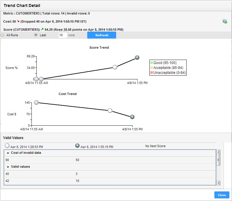
The following image shows the Trend Chart Detail dialog box:
You can view score and cost values that have changed over time. At the top of the dialog box, you can view the total number of rows and the number of invalid rows. The Analyst tool uses historical scorecard run data for each date and the latest valid score values to calculate the score. Under the score and cost trend charts, you can view the valid values for the metric and the cost of invalid data.
Exporting Trend Charts
You can export the score and cost trend charts to a ".xlsx" file to view the data in a file.
1. Open a scorecard.
2. Select a metric, and click Actions > Show Trend Chart.
The Trend Chart Details dialog box appears.
3. Click the Export Data icon.
The Export data to a file dialog box appears.
4. In the File Name field, enter a file name. Optionally, you can use the default file name.
The default file format is Microsoft Excel.
5. In the Invalid Rows field, enter the number of invalid rows that you want to export. You can enter a value up to 100,000 in the field.
6. In the Code Page field, you can select the code page of the file.
7. Click OK.


