Viewing Object Dashboards
View a dashboard for each object within a facet. Use the information in the dashboard to get a visual representation about the data quality rules, processes, roles, change requests, and data privacy in Axon.
You can view object dashboard results for the following areas:
- •Data Quality
- •Process
- •Role
- •Change Requests
- •Data Privacy
Each view has a default predefined view and shows data if the required information is available. You can use filters to change the views. Click the legends on each of the charts to change the display. After each change, Axon revises and reloads the dashboard.
You can view the Data Privacy option only for System and Policy objects.
Data Quality View
Open the Dashboard tab of an object to view data quality scores from the data quality rules that you have created.
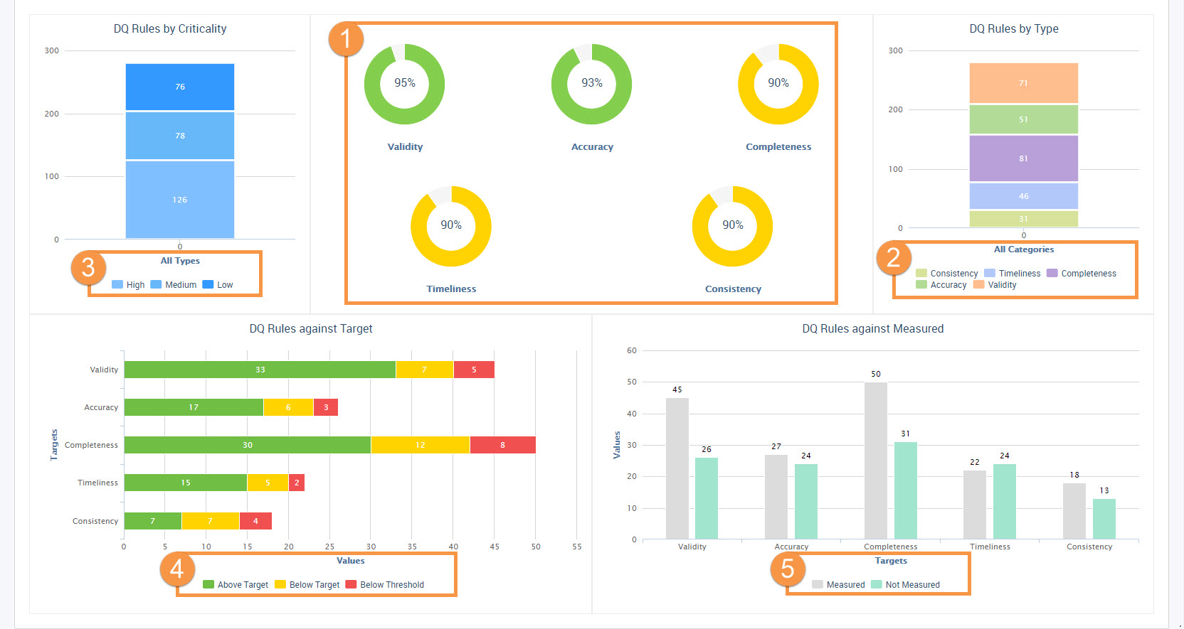
The following image shows the Dashboard page:
- 1. Axon displays the overall score for each data quality rule type. The default data quality rule types are completeness, accuracy, consistency, validity, and timeliness. Displays scores based on the arithmetic average of the rules in the scope of your Unison search. Takes into consideration the most recently uploaded score for each rule, or the most recently measured value in Informatica Data Quality. Determines the chart color based on the average value of the respective thresholds.
- 2. The number of rules by type. Filter scores based on types that you want to exclude.
- 3. The number of rules by criticality. Filter scores based on the criticality that you want to exclude.
- 4. The number of rules by target. Filter the scores based on the target threshold results.
- 5. The number of data quality rules that are measured and not measured.
Axon displays the following sections in the dashboard:
- Data Quality Rules by Criticality
- Displays the results of the data quality rules by criticality. Click any of the colors in the legend below the graph to remove the rules that have the threshold value that you want to hide. For example, if you click the amber color to hide all the data quality rules that have a low criticality, Axon redraws the dashboard to display the scores based on the data quality rules that have medium and high criticality.
- Hover your mouse over the graph to see the breakdown of rules that meet the criticality criteria.
- Data Quality Rules by Type
- Displays the number of data quality rules based on the rule type. You can view information about the following rule types:
- - Accuracy
- - Timeliness
- - Completeness
- - Validity
- - Consistency
- Hover your mouse over the graph to see a breakdown of the rules by data quality rule type. Click a color in the legend below the graph to remove a rule type from the score chart. Axon redraws the dashboard to display the scores based on the remaining rule types.
- Data Quality Rules Against Target
- Displays the number of rules for each rule type by target threshold values and represents the threshold results by color. Axon uses the following criteria to displays the colors:
- 1. Above target - displayed in green color.
- 2. Below threshold - displayed in amber color.
- 3. Below threshold - displayed in red color.
- Hover your mouse over any of the rule types to see the number of rules that meet the measured threshold values.
- Data Quality Rules Against Measured
- Displays the count of the data quality rules that are measured or not measured against the default data quality rule types that are available in Axon. The orange bars display the total number of data quality rules for a particular rule type measured. The blue bars display the total number of data quality rules for a particular rule type that are not measured. Hover your mouse over the graph to see a breakdown of the data quality rules that are measured and not measured.
Process View
To view a dashboard of the process status for an object, go to the Process view.
Axon displays the status of a process in the following sections:
- Type
- Displays a pie chart of the process based on the type. Displays whether it is a control, process, or step-type process. Click a color in the legend to exclude a process type.
- Lifecycle
- Displays a pie chart of the process based on the lifecycle. Displays whether the process is in draft, production, or obsolete. Click a color in the legend to exclude a specific stage in the process lifecycle.
- Status
- Displays a pie chart of the process based on the Axon Status. Axon Status can have Active, Obsolete, Pending Review, Inactive, and Deleted values. Click a color in the legend to exclude a status.
Role View
To view a dashboard of the roles for an object, go to the Role view.
Axon displays the roles information in the following sections:
- Role Type
- Displays a pie chart of roles based on the type. The role type includes knowledge, stewardship, ownership, and authority. Hover your mouse over the graph to see a breakdown by the role type. Click a color in the legend below the graph to exclude a role type.
- Object Type
- Displays the type of object in which you are viewing the assigned roles. For example, if you are viewing the Role dashboard in a Glossary object, the object type is Glossary.
- Role Accepted
- Displays a pie chart that specifies whether the roles are accepted for the object. The values include "Yes" and "No."
Change Requests View
To view a dashboard of the change requests for an object, go to the Change Requests view.
Axon displays the change requests information in the following sections:
- Object Type
- Displays the type of object in which you are viewing the raised change requests. For example, if you are viewing the Change Requests dashboard in a System object, the object type is System.
- By Created Date
- Displays a graph of the change requests created over a period of time. You can view the change requests that are created over the previous years, current year, current quarter, and current month. Click the colors in the legend below the graph to exclude different periods of time.
- By Updated Date
- Displays a graph of the change request updated over a period of time. You can view the change requests that are updated over the previous years, current year, current quarter, and current month. Click the colors in the legend below the graph to exclude different periods of time.

