Data Asset Enrichment
Use the Data Asset Enrichment tab in the dashboard to view the summary of the asset enrichments from Enterprise Data Catalog.
You can view the summary of asset enrichments such as the business description, business term association, classifications, asset certification, data domain association, and people association.
The tab displays analytical charts and statistics based on asset enrichment in different panels. The information that you view in the panels depend on the time range that you specify.
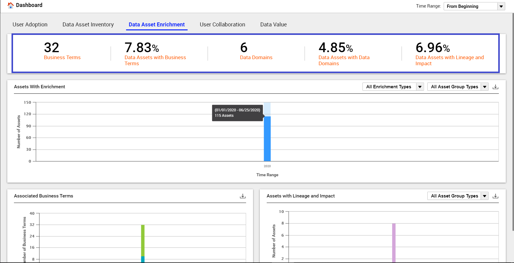
The following image shows a sample Data Asset Enrichment tab with the key metrics highlighted:
Data Asset Enrichment Key Metrics
You can view the following key metrics on the Data Asset Enrichment tab:
- Business Terms
- Displays the count of business terms that are available in the catalog during the specified time range.
- Data Assets with Business Terms
- Displays the percentage of assets available in the catalog that have at least one available association with business terms during the specified time range. You can view the business term association for tables, views, and columns.
- Data Domains
- Displays the count of unique available data domains that are associated with at least one column or field assets available in the catalog during the specified time range.
- Data Assets with Data Domains
- Displays the percentage of available columns or field assets for which data domains are either inferred or accepted during the specified time range.
- Data Assets with Lineage and Impact
- Displays the percentage of available assets that include lineage information or lineage and impact information during the specified time range. You can view the lineage and impact information for tables, views, and columns.
Data Asset Enrichment Charts
The tab displays asset enrichment information in different types of charts. The charts visually display the asset enrichment activities across asset types, such as tables, views, and columns in the catalog. You can download each chart in the CSV format.
You can view the following charts on the Data Asset Enrichment tab:
- Assets with Enrichment
- The Y axis of the chart represents the number of assets with enrichments in the catalog and the X axis represents the time range. The chart displays vertical bars that represent the number of assets with enrichments in the catalog for a particular time range. You can hover over the vertical bars in the chart to view details, such as the total count of assets with enrichments and the time when the asset was enriched. The vertical bars vary based on the time range that you specify. Click the All Enrichment Types drop-down list to view the chart for a specific enrichment.
- Associated Business Terms
- The Y axis of the chart represents the number of active business terms in the catalog and the X axis represents the time range. The chart displays vertical bars that represent the number of business terms and the percentage of associated business terms from the time you configured Data Asset Analytics. You can hover over the vertical bar in the chart to view details such as the total count of business terms and percentage of associated business terms from the time you configured Data Asset Analytics. The chart also displays a legend as shown in the following image:
- The legend represents the data that you view on the vertical bars.
- Assets with Lineage and Impact
- The Y axis of the chart represents the number of assets in the catalog and the X axis represents the time range. The chart displays vertical bars that represent the number of assets with lineage and impact information from the time you configured Data Asset Analytics. You can hover over the vertical bar in the chart to view details such as the total count of assets that include lineage or lineage and impact information from the time you configured Data Asset Analytics.
Downloading the Chart Data
For charts that provide the

option, you can click

to download the chart in CSV format. You can use the downloaded chart in third-party reporting tools to add or enhance reporting details based on your requirements.


 option, you can click
  to download the chart in CSV format. You can use the downloaded chart in third-party reporting tools to add or enhance reporting details based on your requirements.