User Adoption
The User Adoption tab displays analytical charts and statistics for the user logins and searches performed in the catalog.
The following image shows a sample
User Adoption tab with the key metrics highlighted:
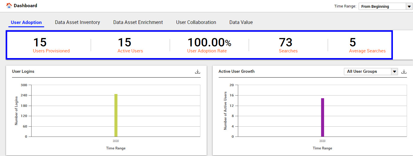
User Adoption Key Metrics
You can view the following key metrics on the User Adoption tab:
- Users Provisioned
- Displays the count of the total number of users configured to access the catalog from the time when Data Asset Analytics was configured.
- Active Users
- Displays the count of the total number of active users who have logged in to the catalog at least once in the specified time range.
- User Adoption Rate
- Displays the percentage of configured users who accessed the catalog in the specified time range.
- Searches
- Displays the total number of searches performed by all users in the specified time range.
- Average Searches
- Displays the average number of searches performed by active users in the specified time range.
User Adoption Charts
Note: You cannot view the user logins and user searches information if Data Asset Analytics is disabled even after you upgrade from any previous version.
You can analyze the following charts on the User Adoption tab:
- User Logins
- The chart displays the total number of users who logged in during the specified time range. You can move your mouse pointer on the bar graph to view the count of user logins. The X axis of the chart represents the time range and the Y axis represents the total number of user logins.
- Active User Growth
- The chart displays the total number of users who were active from the time you configured Data Asset Analytics. You can move your mouse pointer on the bar graph to view the count of users. The X axis of the chart represents the time range and the Y axis represents the total number of active users. Click the All User Groups drop-down list to customize and view the charts for a specific user group.
- User Searches
- The chart displays the total number of searches performed by the users during the specified time range. You can move your mouse pointer on the bar graph to view the exact count of searches. The X axis of the chart represents the time range and the Y axis represents the total number of searches. Click the All User Groups drop-down list to customize and view the charts for a specific user group.
- Top Assets Viewed
- The chart displays a list of the top 25 assets in the catalog based on the maximum number of views.
- The chart includes the following details:
- - Name of the asset
- - Type of asset
- - A numeral that indicates the number of times the asset was viewed.
- - A horizontal bar graph to compare the values.
Note: To see a list of all assets viewed, you can download the chart in CSV format.
Downloading the Chart Data
For charts that provide the

option, you can click
to download the chart in CSV format. You can use the downloaded chart in third-party reporting tools to add or enhance reporting details based on your requirements.