User Collaboration
Use the User Collaboration tab in the dashboard to view the summary of the collaboration activities that users perform in Enterprise Data Catalog Discovery.
The collaboration activities include questions, answers, and reviews that users provide for assets in the catalog. The tab displays analytical charts and statistics based on collaboration activities in different panels. The information that you view in the panels depend on the time range that you specify.
The following image shows a sample
User Collaboration tab with the key metrics highlighted:
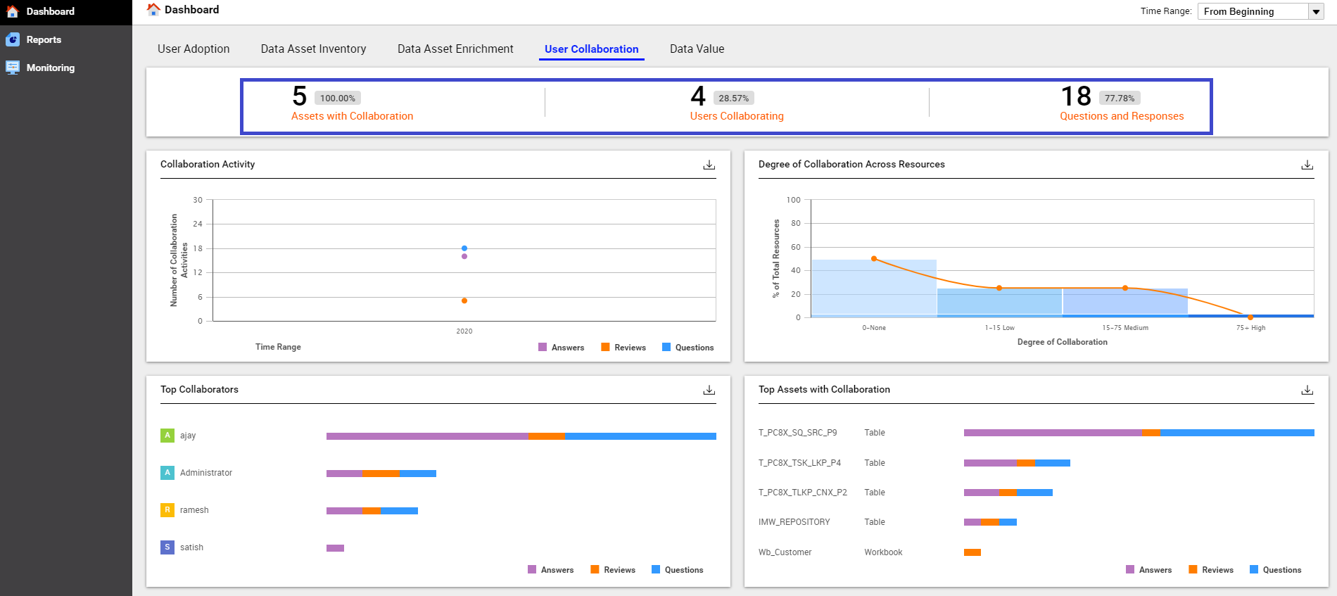
User Collaboration Key Metrics
You can view the following key metrics on the User Collaboration tab:
- Assets with Collaboration
- Displays the count and percentage of available assets that include questions, answers, or reviews available in the catalog during the specified time range.
- Users Collaborating
- Displays the count and percentage of users that are collaborating across the catalog during the specified time range.
- Questions and Responses
- Displays the count of questions asked about assets in the catalog and percentage of questions that were answered by users in the catalog during the specified time range.
For example,
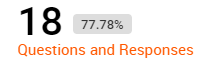
. In this image, 18 questions were asked and 77.78% questions were answered out of the total questions.
User Collaboration Charts
The tab displays the user collaboration information in different types of charts. The charts visually display information based on the collaboration activity, degree of collaboration, top user collaborators, and top assets with collaboration. You can download each chart in CSV format. The charts include a legend to represent the collaboration activities as shown in the following image:
You can view the following charts with collaboration information on the User Collaboration tab:
- Collaboration Activity
- The Y axis of the chart represents the number of collaboration activities in the catalog and the X axis represents the time range. The chart displays dotted lines that represent the different collaboration activities. The dotted lines change based on the time range that you specify.
- Degree of Collaboration Across Resources
- The Y axis of the chart represents the percentage of total resources in the catalog and the X axis represents the degree of collaboration. The chart categorizes the collaboration activities across the resources based on various degrees of collaboration. The degree of collaboration is classified as low, medium, and high range. By default, the chart displays collaboration activities ranging between 1 to 15 under the low range, between 16 to 75 under the medium range, and above 75 under the high range. The chart also displays a line with pointers to represent various degrees of collaboration. You can hover over the pointers to view the percentage of resources that fall under each degree of collaboration. You can also customize the degree of collaboration value range on the Application Configuration page.
- Top Collaborators
- The chart displays the names of the top collaborators in the catalog. The chart also displays horizontal bars that represent the total number and type of collaboration activity each collaborator performed. You can hover over the horizontal bar in the chart to view the total count of each collaboration activity a user performed. You can view a maximum of eight top collaborators in the chart.
- Top Assets with Collaboration
- The chart displays the top asset names and the type of assets that users have collaborated on. The chart also displays horizontal bars that represent the total number and types of collaboration activities that were performed on an asset. You can view a maximum of eight top assets with collaboration in the chart.
Downloading the Chart Data
For charts that provide the

option, you can click
to download the chart in CSV format. You can use the downloaded chart in third-party reporting tools to add or enhance reporting details based on your requirements.