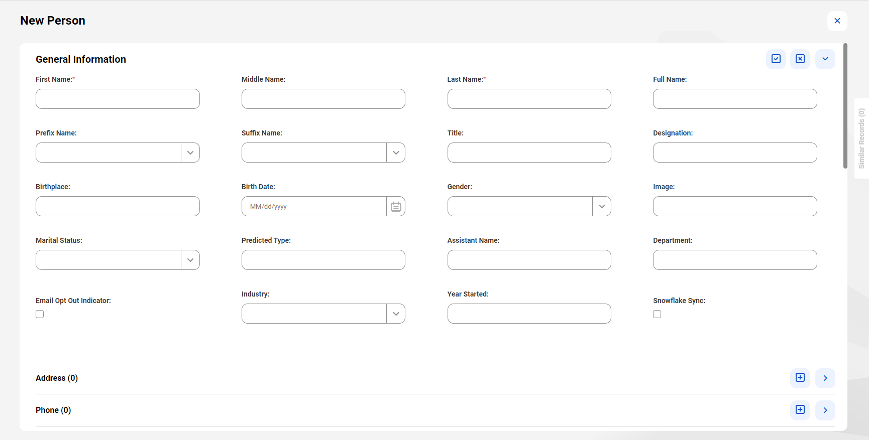
Property | Description |
|---|---|
Title | Name of the section. |
Show border | Specifies whether to display the section border. To display the section border, select the property. |
Validate root fields in this section | Specifies whether to validate data in the root fields added to a section instead of validating data in the root fields added to all the sections. To validate data on the root fields of this section, select the property. By default, all the root fields added to the page are validated for each section. For example, create a custom page that contains two sections, section 1 and section 2. Enable root field validation in section 1. When users update the root field values in section 1 and apply the changes, MDM SaaS validates the root fields added to section 1. When you update the root field values in section 2 and apply the changes, MDM SaaS validates the root fields added to section 1 and section 2. |

Property | Description |
|---|---|
Label | Display name of the field. |
Label Position | Optional. Position for the display name to appear. The following label positions are available:
Default is Top. |
Hide label | Optional. Indicates whether to hide the field label. To hide the field label, select the property. |
Description | Displays the description of the field. |
Default Value | Optional. Default value of the field. |
Tip Text | Optional. Additional information about the field. |
Width (%) | The width of the field. Default is 100%. |
Required field | For internal use only. |
Read only | Optional. Indicates whether you can edit the field. To configure the field as a non-editable field, select the property. |
Render As | User interface element that you want to use for the field. The options vary depending on the selected field. The following options are available:
Note: URL fields for the purpose of previewing content render as images. URL fields for the purpose of downloading content and opening content from source render as text. |
Ghost Text | Optional. A text that provides guidance for input. This text appears in the text fields, and the user input replaces it. For example, the placeholder text for the First Name field can be Enter a first name. |
Placeholder Text | Optional. A text that provides guidance for input. This text appears in drop-down lists, and the user input replaces it. For example, the placeholder text for the Country drop-down list can be Select a country. |
Date Format | Indicates the format of a date for the date fields. Default is Browser Locale. You can select another date format, such as MM/DD/YYYY or YYYY-MM-DD. When the date format is set to use the browser locale, the date and time fields use the date, time, and clock formats that the browser locale uses. The browser locale format overrides the values of the Time Format and Clock Format properties. For more information about date and time values, see Date and time values. |
Time Format | Indicates the format of time for the date and time fields. Default is HH:MM. If the Date Format property is set to Browser Locale, then the browser locale format overrides the value of the Time Format property. |
Clock Format | Indicates the format of a clock for the date and time fields. Default is 24 Hrs. If the Date Format property is set to Browser Locale, then the browser locale format overrides the value of the Clock Format property. |
Page | Date and Time Format | Example |
|---|---|---|
My Jobs | MMM dd, yyyy h:mm:ss TT | Apr 21, 2014 6:30:00 AM |
Search | Long | 04/21/2024 6:30:00 AM |
Edit in Bulk | Long | 04/21/2024 6:30:00 AM |
Record Details | Long | 04/21/2024 6:30:00 AM |
Source Records | Long | 04/21/2024 6:30:00 AM |
Related Records | Long | 04/21/2024 6:30:00 AM |
Hierarchy | Long | 04/21/2024 6:30:00 AM |
Relationship Graph | Long | 04/21/2024 6:30:00 AM |
History | Short | 21 Apr 2024 06:30 |
Reports | Short | 21 Apr 2024 06:30 |
Workflow Inbox | Long | 04/21/2024 6:30:00 AM |
File Import | Long | 04/21/2024 6:30:00 AM |
CLAIRE panel | Long | 04/21/2024 6:30:00 AM |
Browser Locale | Language | Long Format | Short Format |
|---|---|---|---|
en | English | MM/dd/yyyy, h:mm:ss TT | MMM dd, yyyy, h:mm TT |
en_AU | English (Australia) | dd/MM/yyyy, h:mm:ss TT | dd MMM yyyy, h:mm TT |
es | Spanish | dd/MM/yyyy, h:mm:ss | dd MMM yyyy, H:mm |
fr | French | dd/MM/yyyy HH:mm:ss | dd MMM yyyy, HH:mm |
de | German | dd.MM.yyyy, HH:mm:ss | dd.MMM yyyy, HH:mm |
pt | Portuguese | dd/MM/yyyy, HH:mm:ss | dd/MMM/yyyy, HH:mm |
pt-BR | Portuguese (Brazil) | dd/MM/yyyy, HH:mm:ss | dd/MMM/yyyy, HH:mm |
ru | Russian | dd.MM.yyyy, HH:mm:ss | dd MMM yyyy г., HH:mm |
ja | Japanese | yyyy/MM/dd H:mm:ss | yyyy年M月dd日 H:mm |
ko | Korean | yyyy/MM/dd H:mm:ss | yyyy년 MMM dd일 a h:mm |
th | Thai | dd/MM/yyyy HH:mm:ss | dd MMM yyyy HH:mm |
zh-CN | Chinese (Simplified, China) | yyyy/MM/dd HH:mm:ss | yyyy年M月dd日 HH:mm |
nl | Dutch | dd-MM-yyyy, HH:mm:ss | dd MMM yyyy, HH:mm |
Property | Description |
|---|---|
Label | Display name of the field group. |
Description | Displays the description of the field group. |
Path | Hierarchy path of the field group. |
Tip Text | Optional. Additional information about the field group. |
Read only | Optional. Indicates whether you can edit the field. To configure the field as a non-editable field, select the property. |
Property | Description |
|---|---|
Render As | Display style of the fields. The following options are available:
Note: To display a field group in a table effectively, ensure that the panel containing the field group uses at least 50% of the page to enhance user experience. Note: For nested field groups, the List and Form options are available. For dynamic field values attributes, the Table and Form options are available. If the associated dynamic field definition contains nested field groups, the dynamic field values render as a form in a business application. |
Title Field | Field to display as the title of the field group. Appears when you select the Render As option as form or card. |
Thumbnail Field | Optional. URL field in a field group to preview content as thumbnails. Appears when you select the Render As option as list or card. |
Sort By | Field based on which the entries in a field group are sorted by default. |
Sort Order | Order in which the field group entries are sorted by default. The order can be ascending or descending. Default is ascending. Applicable only when you configure the Sort By field. |
Navigation Style | Navigation style of the section. The following navigation style is available:
|
Maximum Records Per Page | Maximum number of entries to display in a section. For example, the address section contains multiple entries. If you set the value to 6, the section displays a maximum of six entries. The next six entries display in the next section, and so on. |
Property | Description |
|---|---|
Title Field | Field to display as the title of the card. |
Highlight Field | Optional. Field to display as a highlighted field of the card. |
Thumbnail Field | Optional. URL field in a field group to preview content as thumbnails. |
Cards Per Row | Maximum number of cards to display per row. You can display up to 12 cards per row. Default is 3. Note: The number of cards also depends on how you split a panel. Based on the space that a section of a panel gets, the section can display one or two cards. |
Property | Description |
|---|---|
Fields | Fields to display in line 1 or line 2 of the card. |
Display As | Optional. Indicates the arrangement style of the fields. The following field arrangement options are available:
|
Show field label | Optional. Indicates whether to show the field labels. To display the field labels, select the property. |
Panel Split Ratio | Number of Nested Field Group Levels |
|---|---|
1:1:1 | Three levels in each section. |
1:1 | Five levels in each section. |
2:1 | Eight levels in the first section, and three levels in the second section. |
1:2 | Three levels in the first section, and eight levels in the second section. |
1:2:1 | Two levels in the first and third section, and five levels in the second section. |