Using the DesignHome
The Design Home page is provides access to all of the objects in your system. From here, you can search for existing objects or create new guides, processes, process objects, service connectors and connections.
Each object opens on a separate page or "tab" to the right of Design Home.
Guides List Area
All of your objects appear in this list within the Design Home page, grouped by object type and by user-defined tags, if any:
Tags create categories that act like folders to group objects in this List area. The number in parenthesis is the number of objects that have the same tag.
The tag categories act like an index. If you click on one of them, only objects in that category display. You can define Tags in the Properties for each object you create. You can enter more than one tag for each object.
Tags With Special Meaning
- •* Any *: The guide is not associated with an object. In contrast to Home, it doesn't appear on a page.
Guide Home Toolbar
Use the Design Home toolbar to manage your objects. Here is the toolbar:
The following table describes each button:
Button | Description |
|---|
| Opens a list of objects that you can create. When you click an object, it opens in a new tab. |
| Opens a selected object. Note: You can also open an object by double-clicking on it. |
| Creates a copy of the selected object. Process Designer adds a numeric suffix to the object's title; for example, the suffix could be '(1)'. Note: To rename an object, you must unpublish it, change the name, and then publish it again. |
| Deletes the selected objects. Click Delete and then click Yes to indicate that you are sure that you want to delete the object. Note: You cannot undo deleting an object. Also, when you delete an object, you unpublish the object. |
| Writes objects to your computer. Click the Export button, select one or more guides in the list, and then click Export. If you select more than one guide, Ctrl+ left click on all but the first. If you select more than one, they will be in a ZIP file. If you select only one guide, the exported file will be an XML file with an additional two or three letters that describe the object being exported. For example, if you export a connection object, the extension will be conn.xml. When you click Export, the following dialog box appears: |
| Imports previously exported objects. When you click the Import button, you see the following dialog box: Use the following steps Follow the below steps to import objects: - 1. Click Browse to find either a single object or a ZIP file with more than one object.
- 2. Select Overwrite designs with the same name if you want to replace an existing object with an imported object with the same name.
- 3. You can enter tags that describe the imported files in the Tags field. You must use only ASCII characters when you enter tags. Other types of characters, like UTF-8, are currently not supported.
- 4. Click Import to import the objects.
After you click Import, the following dialog box appears: You can click on the objects in this dialog box to see an expanded view of each item in the background. |
| Click Publish to make the object ready for use, and visible to other users. Note: You do not need to publish Process Objects. They are available as soon as you save them. If you republish an object that is being used by another user, all running instances are migrated to the newly published object. If, however, all running instances are not migrated, the old definition is used To stop some objects, like guides, from being used with an older definition, clickRestart on a running guide to use the new definition. If you want other users to use only your newly published guide, clickTerminate Running Guides at the bottom of the Details area. This stops all instances of that guide. Note: If you publish a process that uses Salesforce, and the process is invoked by its URL, you must have a published Salesforce connection to invokes a process. |
| Click Unpublish to make an object unavailable and no longer visible to users. If the object is being used by others when you unpublish it, it remains available to them until the process stops running. Note: If you urgently need to stop other users from using a running guide (but not a running process) click Terminate Running button at the bottom of the Details area. |
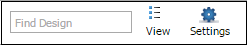
| Use the Find Design field to search for text that matches what you enter. This text can be part of an object's name or an object's description. After you type three letters, you see a list of objects containing this text. As you type additional letters, irrelevant objects no longer appear. |
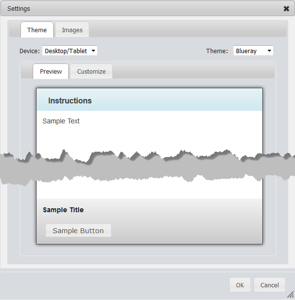
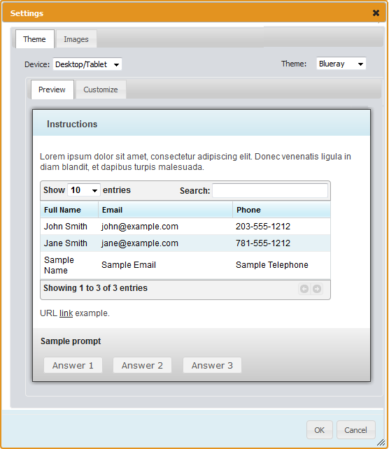
| Note: Settings only apply to guides created within Guide Designer. Click Settings to view a dialog box where you can select a theme or upload an image. Following is a screen shot of the Theme tab: When you select a theme, the way the guide page displays changes. You can edit the way a theme appears by altering the CSS (Cascading Style Sheet) that it uses. For more information, see Customizing Themes. If you select Mobile Theme for a guide, your users will only see the guide when they access it from a mobile phone browser. Use the Images tab to upload images that you can place in steps. The following is a screenshot of the Images tab The fields within this dialog box are: - - Search area: Use the top-left field to find an image using text that you enter in the Title or Description fields. Use the right text box to type a tag that was used to label an image. As you type a tag's text, you will see tags that match what you are typing.
- - URL: The URL for the imported image.
- - Title: A title for the image.
- - Description: Text that describes the image.
- - Tags: If you have many images, associate each image with a tag. For the image in the above figure, the tag is 'flowers'.
- - Browse: Click this button to select an image on your computer. After you select and confirm your choice, the image appears here.
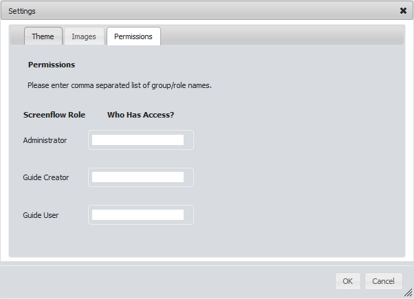
To delete an image, place your cursor over the image, and then click the small red "x" that appears on it. Some applications may display a Permissions tab, as shown below: The fields within Permissions dialog box are: - - Administrator: Administrators have complete access to guides. They can create guides, run guides, and use the Permissions tab. Only administrators can see and use the Terminate Running Guides. This button appears in the upper-right panel of the Guides pane.
- - Guide Creator: Guide Creators can create and run guides. However, they do not see the Permissions tab.
- - Guide User: Guide Users can only run guides.
Note: The Administrator field is mandatory. The Guide Creator and Guide User fields are optional. Also, you cannot enter a user name here. |
| Select either List or Icon from this list to change how information about objects is displayed. Most figures in this area of the page display in the Icon view. The List view, of which a portion is seen here, displays information about objects in a more compact format. |
Details Area
The Details area contains information about a guide. The items at the top of this area are those that were entered into a Properties dialog. The rest are modification and publication information added by Process Designer. Similar information is displayed for other kinds of objects when you select them in the File area. The following figure shows the Details area from within Process Designer for a guide. Other objects have less information, and only a guide will have a usage area.
Note: If you are using Process Designer from within Salesforce, you will see less information.
In some cases, you will see a Run Guide button following the guide's name. After you press this button, Process Designer process launches the guide in a new tab. If this was created in Guide Designer and the theme was Smart phones, the guide displays using the mobile theme.
Notice the Embed Code text area. This is an address that you can embed in pages so that the guide can be accessed outside of Process Central. For example, this could be the address that a mobile phone user taps to use a mobile guide.
The Terminate Running button stops this guide from executing. Because more than one user could be using this guide, this ends all of them. If you did not publish a new version of this guide, Process Designer restarts the guide the next time a user opens it.
Note: Only users with admin permissions can terminate a running guide.
If you had republished a guide that is being used, Process Designer switches people using it to the new definition if it can. If they should be using the newly published guide, press this button.
Customizing Themes
Built-in themes determine how a guide looks on desktop/tablet devices and smart phones. When a guide displays, it uses the theme set in the guide properties.
You can also customize guide themes and add images.
To customize a guide theme, select Settings in the toolbar:
Here, you can make and preview theme changes.
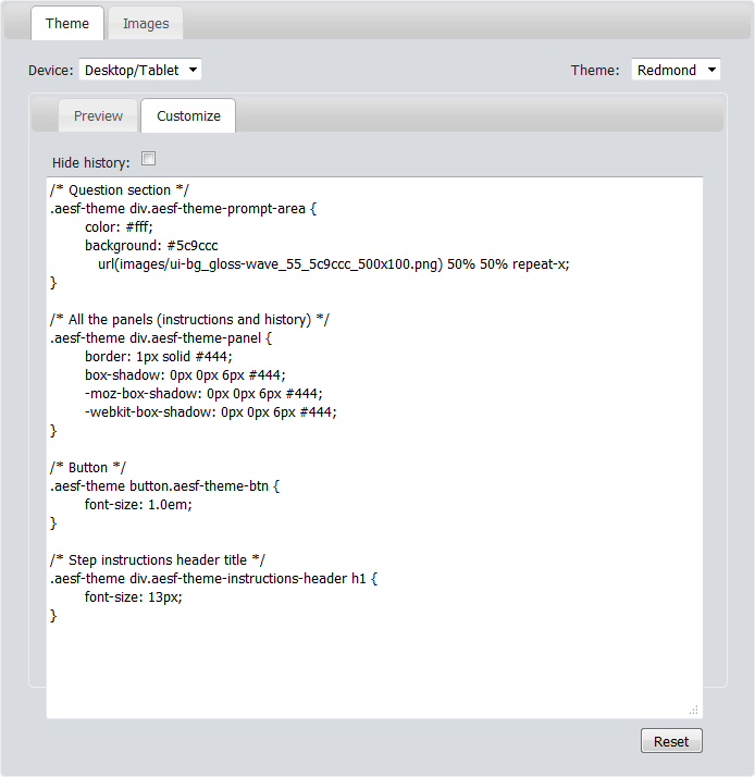
Click the Theme tab to display options to customize and preview.
Select the target device from the Device list to display the available themes for that device. For example, if you select Desktop/Tablet, the available themes include Blueray, Redmond, and Vader.
Customize Options
Click the Customize tab to modify details for a built-in theme.
Here, you can modify the CSS class details for each part of the guide, step, or paragraph or character style in the theme. For example, to change the color of the step's header text to blue, you would set the following:
aesf-theme div.aesf-theme-instructions-header h1 {
color:blue;
}
You can use any CSS property normally available for the element type.
See Settings for information on adding images.
Other Commands
You can also use these options:
- •Hide History: Check to hide the history pane when a guide launches. (The user can still display this panel during guide execution.)
- •Reset: Click to revert to the original theme settings.
Usage Area
Note: The Usage area and its buttons are only available for guides.
Pressing the buttons within the Usage area tells Screenflow to display summary information about the selected guide. Information appears in its own tab.
Note: If logging was turned off for a guide, information is either limited or will not exist. This is set using the Guide Execution Logging setting within the Guide Properties Advanced tab.
Current Activity
Note: The Usage area and its buttons are only available for guides. Also, only users with admin permissions can view this report.
Selecting the Current Activity button tells Process Designer to display a Current Activity tab for the selected guide. The information displayed shows the interactions that occurred today.
The table displays:
- •User: The user who ran the guide.
- •Object: The object (often a person) upon which the guide was invoked. Click on the link to go to it.
- •Current Screen: The step being executed when this report is created.
- •Started: The date and time at which the guide began executing.
Note: If logging was turned off for a guide, information is either limited or will not exist. This is set using the Execution Logging setting within the Guide Properties Advanced tab.
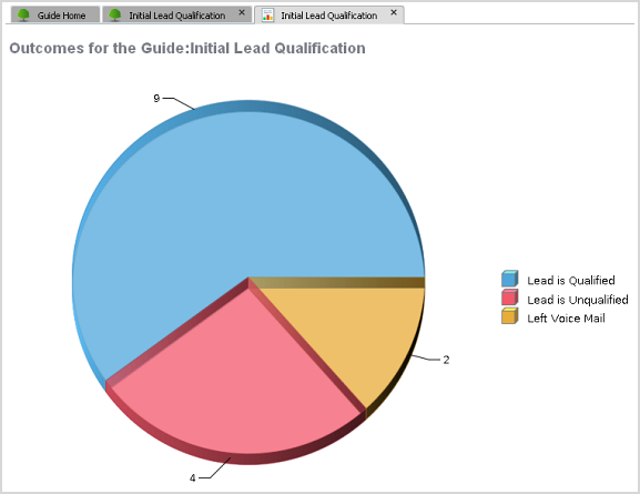
Outcome Chart
Note: The Usage area and its buttons are only available for guides. Also, only users with admin permissions can view this report.
Selecting the Outcomes button tells Screenflow to display a pie chart showing the different outcomes that occurred.
Note: An "outcome" is a value (always text) that indicates the result of executing a guide to its final step. These outcomes were set in the guide properties.
The number of outcomes shown in the chart is the total for all interactions, not just today's.
Note: If logging was turned off for a guide, information is either limited or will not exist. This is set using the Guide Execution Logging setting within the Advanced guide properties.
Detailed Activity Report
Note: The Usage area and its buttons are only available for guides. Also, only users with admin permissions can view this report.
Selecting the Detailed Activity Report button tells Screenflow to a display a comprehensive activity report. It has more information that is shown in the Current Activity report.
The table displays:
- •User Name: The user who ran the guide.
- •Object: The object (often a person) that launched the guide. This is shown as a link that you can use to go to the object's Screenflow's page.
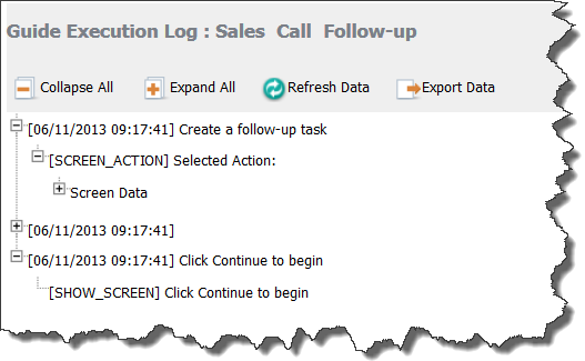
- • Screen: The last step executed within the guide. If you click on an item's link, Screenflow displays a log, showing activities.
- •Start Date: The date and time at which the guide began executing.
- •Duration: (not in Current Activity report) The amount of time it took to execute a guide's steps.
- •Outcome: (not in Current Activity report) The outcome set when the guide completed executing.
The top of the report contains buttons and controls on both the left and right. The right side buttons let you move between pages. The left side is discussed in the following sections.
Note: If logging was turned off for a guide, information is either limited or will not exist. This is set using the Guide Execution Logging setting within the Guide Properties Advanced tab.
Toggle Table of Contents
Note: These buttons, the Detailed Activity Report, and the Usage area are only available for guides. Also, only users with admin permissions can see this information.
Pressing the Toggle table of contents buttons tells Screenflow whether it should display a table of contents with the report.
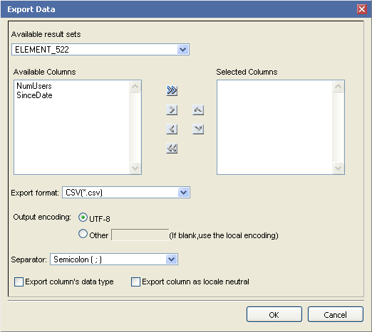
Export Data
Note: These buttons, the Detailed Activity Report, and the Usage area are only available for guides. Also, only users with admin permissions can see this information.
Pressing the Export data button tells Screenflow to display a dialog box that lets you define the way in which it exports a report's data.
The following snapshot shows the controls within this dialog box:
The only control that you should change is Separator. This command names the character that separates columns within a record in the exported data. Choose one of the following: Comma, Semicolon, Colon, Vertical Line, or Tab.
Export Report
Note: These buttons, the Detailed Activity Report, and the Usage area are only available for guides. Also, only users with admin permissions can see this information.
Pressing the Export report button tells Screenflow to display a dialog box that lets you define a report's output format. Your report is not paginated or otherwise changed by Screenflow. Instead, the data it will write will be compatible with one of these applications.
Here is this dialog box:
Items within this dialog box are:
- •Export Format: Choose the export format. Screenflow can export the report in the following formats: Excel, PDF, PostScript, PowerPoint, and Word.
- •Pages: Sets the pages to be written. Your choices are All pages, Current page, and Pages. If Pages is selected, you can enter page numbers and page ranges; for example, 1-6, 9, 15, 21-24.
- •Size adjustment buttons: If PDF, PostScript, or PowerPoint is selected, you can set the relationship between the report's actual page size and its print size. Your choices are Auto (which will make the report smaller if it will not fit on the page), Actual Size (no size changes are made), and Fit to whole page, which can either make the document larger or smaller so that it fits on one page.
Print Report
Note: These buttons, the Detailed Activity Report, and the Usage area are only available for guides. Also, only users with admin permissions can see this information.
Pressing the Print Report button tells Screenflow to create a file in the format you specify, display it in its application (which is either a browser or Adobe Acrobat), and invoke the application's print dialog box so that you can print it.
The following illustration shows the controls within this dialog box:
The controls within this dialog are:
- •Print Format: Choose either HTML or PDF. If you choose PDF, additional options let you set how the page's image fits on a page, as follows: Auto, Actual Size, and Fit to whole page. (These options are discussed in Export Report.)
- •Pages: Sets the pages to be written. Your choices are: All pages, Current page, and Pages. If Pages is selected, you can enter page numbers and page ranges; for example, 1-6, 9, 15, 21-24.