Product 360° View Configuration
Topics covered in this pages are mentioned below.
How to configure Product 360 view tab in Detail tab?
How to configure styles of Nodes and Edges?
How to configure Information on Node popup?
Configuration of Node labels
1. How to configure Product 360 view tab in Detail tabs?
To remove/to add Product 360 view from/to detail view, you need to create *.detailtab.parameterized.xml file inside webdefinitions folder (aka customization area) respective to entities. Also you can move the respective *.detailtab.parameterized.xml files from default folder to webdefinitions folder and modify it accordingly. You need to define a tab entry with id, permissionId, position, rootEntity and tabType inside the customized xml file.
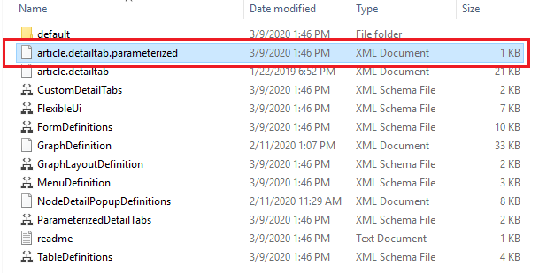
Here, This is example of article.detailtab.parameterized.xml. User can customize detail tab for product, variant, structure and item detail tab.
If user do not want to remove any existing tab from the UI, then do not remove any <tab> entry from the file moved from default folder to webdefintion folder (corresponding *.detailtab.parameterized.xml files for different entities like( * = ) product, article, variant, structure ).
article.detailtab.parameterized.xml
|
1 |
<?xml version="1.0" encoding="UTF-8" standalone="yes"?> |
2. How to configure styles of Nodes and Edges?
User can configure nodes and edges styles by defining GraphDefinition.xml inside webdefinitions customization area or copying the file from default to webdefinitions folder and modifying it..
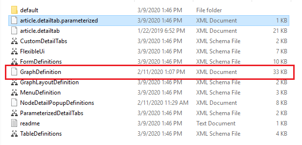
In the graph feature, you can define customized styles for particular node type and edges.
For that, you have to customize XML file. The following attributes and elements have to be defined in XML.
Edge Attributes
|
Attribute name |
Attribute Value |
Optional/Mandatory |
Description |
|
id |
Any entity type |
M |
This attribute is used to identify on which type of particular styles should apply to the edge |
|
sourceNodeId |
id of source node |
M |
This attribute is used to identify edge style for source node id |
|
targetNodeId |
id of target node |
M |
This attribute is used to identify edge style for edge node id |
Edge Style
|
Style Name |
Optional/Mandatory |
Possible Style Value |
Description |
|
sourceArrow |
O |
NONE, SIMPLE, SHORT, DEFAULT,DELTA |
Style defines arrow of edge at source node side |
|
targetArrow |
O |
NONE, SIMPLE, SHORT, DEFAULT, DELTA |
Style defines arrow of edge at target node side |
|
fill |
O |
Any hex-code of color |
Gives background color of graph node |
Label Style for Edge
|
Style Name |
Optional/Mandatory |
Possible Style Value |
Description |
|
fontFamily |
O |
Any font family for e.g., Times New Roman, Arial, etc. |
To give customize font type to label of the node/edge |
|
fontSize |
O |
Any size in pixel |
To give customize size to label of the node/edge |
|
textFill |
O |
Any hex-code of color |
Gives background color of graph node/edge |
|
display |
O |
true/false |
If diaplay=true set by user then label of the edge will be displayed to user |
Node Attributes
|
Attribute name |
Attribute Value |
Optional/Mandatory |
Description |
|
id |
Any entity type |
M |
This attribute is used to identify on which type of particular styles should apply to the node |
Node Style
|
Style Name |
Optional/Mandatory |
Possible Style Value |
Description |
|
width |
O |
any size in pixel |
Defines width of graph node |
|
height |
O |
any size in pixel |
Defines width of graph node |
|
stroke |
O |
5px dotted #000000 |
Defines border thickness, border style and border color |
|
fill |
O |
Any hex-code of color |
Gives background color of graph node |
Label Style for Edges/Nodes
|
Style Name |
Optional/Mandatory |
Possible Style Value |
Description |
|
fontFamily |
O |
Any font family for e.g., Times New Roman, Arial, etc. |
To give customize font type to label of the node/edge |
|
fontSize |
O |
Any size in pixel |
To give customize size to label of the node/edge |
|
textFill |
O |
Any hex-code of color |
Gives background color of graph node/edge |
|
display |
O |
true/false |
If diaplay=true set by user then label of the edge/node will be displayed to user For edges, display=false by default For nodes, display=true by default |
Note
Default style for node has to be configured by the user as per his styling requirements for default node and default edge as shown in below example. If user doesn't provide default styling for a node/edge then it will not be displayed.
Label Style is also optional for edges
User can change GraphDefinition.xml file according to their requirement.
3. How to configure Information on Node popup?
You can also configure details you want to see after clicking on ![]() button inside Popup. For this you have to define the customized NodeDetailPopupDefinitions.xml.
button inside Popup. For this you have to define the customized NodeDetailPopupDefinitions.xml.
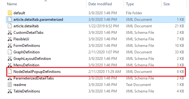
Here find attached sample NodeDetailPopupDefinitions.xml file. In this file you can add or remove fields, fieldGroups and columns related to the entity as per requirements for particular entity.
4. Configuration of Node labels preferences
User can change Node label's preferences inside plugin_customization.ini file inside configuration folder as shown below.
# ---------------------------------------------------------------------------# Relationship node label preferences# ---------------------------------------------------------------------------# Label Type for node in relationship graph can be SHORT/LONG/DESCRIPTION# com.heiler.ppm.relationship.server/nodeLabelType.Article = DESCRIPTION # com.heiler.ppm.relationship.server/nodeLabelType.Product2G = DESCRIPTION# com.heiler.ppm.relationship.server/nodeLabelType.Variant = DESCRIPTION# com.heiler.ppm.relationship.server/nodeLabelType.StructureGroup = SHORTAbove mentioned, the default configuration for particular type of node. User can choose from SHORT, LONG or DESCRIPTION type for specific node as per requirement.
SHORT - Short description will be displayed on Node as label
LONG - Long description will be displayed on Node as label
DESCRIPTION - Item no. will be displayed in absence of short description
These relate to the repository label settings, and can be tweaked even further directly on the respective entities within the repository.
5. Permissions
"Items of the product" or "Variants of the product" or "Items of the variant"
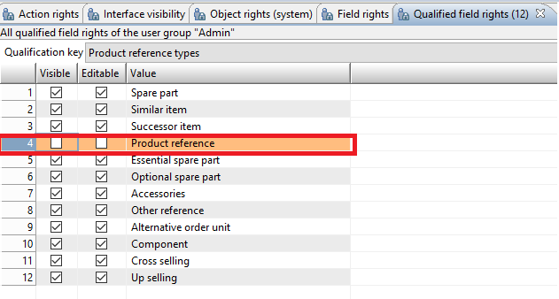
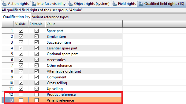
Users can control the visibility of "Items of the product" or "Variants of the product" or "Items of the variant" node in Product 360 view via a combination of Action Rights and Qualified field rights.
Both conditions should be true for the node to be displayed in Product 360° View.
|
Node |
Action Right |
Qualified field rights |
|
Items of the product |
Items, general access |
Product reference types → Product reference |
|
Variants of the product |
Variant management, general access |
Variant reference types → Product reference |
|
Items of the variant |
Items, general access |
Variant reference types → Variant reference |

