Task UI and Dashboard configuration
Introduction
Flexible UIs are used in Product 360 for two purposes:
Defining dashboards that offer a tailored overview of the Product 360 data from which the user can switch to relevant details easily.
Defining task UIs which help the user to focus on just the data and actions that are needed to accomplish an assigned task.
Flexible UIs are defined in an XML based specification language. The root tag is flexUi. It has a single attribute: version. The version is currently fixed at 1.0.0. It may be increased in future releases if/when substantial new features are added to the specification language.
The rest of this document describes the concepts and details used in flexible UI templates.
Layout
Flexible UIs consist of components. These components need to be arranged in a specific way which is the role of the layout tag. It is structured as follows:
The layout type is specified as an attribute of the layout tag. Different layout types have different approaches for arranging the components. As of now only one layout type (grid) is supported.
A layout type may support a number of parameters to fine tune its behavior. These parameters are supplied via parameter tags with key and value attributes, where the key specifies the parameter name.
One or more components are specified next. They will be arranged on the screen per the rules of the layout type.
Each component can carry additional parameters relating to the layout to further fine tune the appearance. These parameters are nested within a layoutData tag to differentiate them from parameters of the component itself.
Here is the definition of a simple flexible UI to show the basic structure:
<flexUi version="1.0.0"> <layout type="grid"> <!-- these parameters specify the details for the "grid" layout used here --> <parameter key="columns" value="2"/> <parameter key="rows" value="1"/> <component type="messageBox" identifier="message1" i18NKey="Greetings"> <layoutData> <!-- this area specifies layout details for this component --> <parameter key="colSpan" value="2"/> </layoutData> <!-- this is a parameter specific to the functionality of the individual component --> <parameter key="message" value="Hello, world!"/> </component> </layout></flexUi>Grid layout
In this type of layout the available space for the UI is divided into cells of a grid. Similar to HTML tables, there are a number of columns and rows which are defined at the layout level. Each component can occupy several adjacent cells in this grid.
Components are added to the grid in the sequence they appear in the XML. For each component the layout algorithm looks for free space of the appropriate size, going from left to right and top to bottom, i.e. the first row is filled as much as possible, skipping to the next row when the next component would not fit any more in the current row. Cells that remain unoccupied may be filled with a subsequent component if it fits, meaning that the layout tries to fill out empty spots as soon as possible.
Collapsing components
With collapsible components the user can temporarily minimize information that is not needed and use the additional space to increase the size of other components. In general a component can only be collapsible if it occupies the full width or the full height of the UI. Through this restriction the collapsing behavior is working in a way that is intuitive for the user: a whole column (or a whole row) is collapsed and all other columns (rows) are proportionally increased in size. If it were possible to minimize a component that only occupies part of the width/height of the UI then the components would have to be rearranged on the fly to fill out the empty space, making it harder for the user to relocate any individual components.
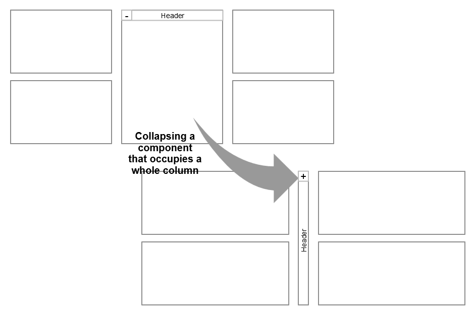
Horizontal collapsing
When a component occupying a whole column is marked as collapsible it gets a button added in the top left of its header. Depending on the state the button displays a minus sign for collapsing or a plus sign for expanding the component.In collapsed mode the width of the component is reduced to the width of the button and the component title is displayed in a banner below the button rotated 90 degrees to to the left.
Vertical collapsing
When a component occupying a whole row is marked as collapsible it gets a button added in the top left of its header. The button displays a triangle pointing right in collapsed state and pointing down in expanded state. When collapsed the component is reduced to its header.
For a finer control of the collapsed state of a subgroup of components see the group component below.
 Note that the goal of collapsing is to have more space for other components. Therefore a component can only be collapsed if some other component(s) remain visible. To enforce this, the button for collapsing a component is hidden if it is the only component to be be fully visible currently.
Type: grid
|
Parameter name |
M(andatory) |
Layout parameter (LP) |
Example values |
Description |
|
columns |
O |
LP |
1 (default) |
Specifies the number of columns in the grid. |
|
rows |
O |
LP |
1 (default) |
Specifies the number of rows in the grid. |
|
columnWidth |
O |
LP |
css width in pixels (like "300px") |
Cell width. By default all available width is equally divided between all cells. |
|
rowHeight |
O |
LP |
css height in pixels (like "300px") |
Cell height. By default all available height is equally divided between all cells. |
|
spacingSize |
O |
LP |
css size in pixels (like "25px") |
If columnWidth or rowHeight are defined the desired spacing between cells needs to be specified as well (default 6px). |
|
colSpan |
O |
CLP |
1 (default) |
Number of cells occupied by component in horizontal direction. |
|
rowSpan |
O |
CLP |
1 (default) |
Number of cells occupied by component in vertical direction. |
|
collapsible |
O |
CLP |
true false (default) |
Specifies whether the component should be collapsible in the UI. |
|
collapsed |
O |
CLP |
true (default) false |
Specifies whether the component should be collapsed initially. Only applies if collapsible is set to true. |
Grouping components
With the group component it is possible to occupy an area in the layout and then place a number of nested components into this area. In this way it is possible to create layouts that break up the rigid structure of the grid. For example a group can occupy 4 columns and then place 5 components in this area that share this space equally. Using size ratios for the individual components the structure of the UI can deviate from the enclosing layout even more.
The second feature of groups is that they manage the collapsible behavior locally between the nested components.
Use the flexibility of the group component carefully. The overall UI should still present a clear structure to the user.
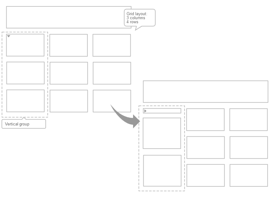
From the perspective of the enclosing layout the group component acts like a single component and it carries the layout data for the whole group (however groups do not support the collapsible/collapsed parameters, i.e. a group as a whole cannot be collapsed within its layout). The layoutData parameters that can be set for each nested component are defined by the group component - see below.
Tag: group
|
Parameter name |
M(andatory) |
Group parameter (GP) Component layout data |
Example values |
Description |
|
direction |
O |
GP |
horizontal (default) vertical |
Direction for placing the child components. |
|
collapsible |
O |
CLP |
true (default) false |
Specifies whether the component should be collapsible in the UI. The direction of collapsing is defined by the direction of the group. |
|
collapsed |
O |
CLP |
true (default) false |
Specifies whether the component should be collapsed initially. |
|
sizeRatio |
O |
CLP |
1 (default) |
Defines the relative amount of space (in the direction of the group) the component will be assigned. By default all components have ratio 1 and the space will be distributed equally. With three components and ratios set to 1, 2, and 1, the middle component will get half the space while the others get a quarter each. If the middle component is collapsed the available space is split equally between the other two as both have the same ratio. |
Data Sources
A data source can be used to retrieve a set of entity items (e.g. articles or products). The underlying mechanism used for providing the data set is dependent on the data source type. Each data source is defined using a common XML structure. Data source definitions appear nested in component instance definitions. The respective component type specifies if and how many data sources it supports and what identifiers those data sources should have.
Explicit data sources are mostly used in dashboard components. Within the flexible task UI there is always an implicit data source consisting of the entity items attached to the task.
The most common starting points for specifying sets of entity items in Product 360 are:
Catalogs - all the items of either the master catalog or a supplier catalog
Assortments - all the items within an assortment
Structures - items that have been classified in a specific structure system to any structure group or items classified to a specific structure group
=> these are covered by the entity report based data source types, see examples belowUser defined saved searches with flexible criteria for defining a set of items
=> there is a separate data source type for saved searches, see belowAd hoc searches using a detailed search expression
=> this is implemented by a special entity report called "bySearch" and is available through the "Report by alias" data source type, see example below. The expression syntax is documented under "REST Search Query Language".
|
Field / subelement |
Description |
|
type |
This specifies the type of the data source. See the entries below for possible values. |
|
identifier |
Unique name within the scope of the data source definition. For example a specific component may support multiple data source definitions and the identifier can be used to select the right one. |
|
ref |
Reference that is used to identify the underlying instance that will provide the data. For example the unique identifier of an entity report if the underlying mechanism is report based. |
|
entity |
The entity of the items that are provided. This only needs to be specified for some data source types where the "ref" field on its own is not unique. |
|
parameter |
Key / value pairs providing parameters for the underlying mechanism. For example in case of reports these pairs are matched to parameters defined in the actual report. The following entry specifies that the parameter "catalog" should be set to "Apparel": <parameter key="catalog" value="Apparel" /> Additionally a special suffix .editable is recognized in the parameter key. The value is expected to be a boolean (true/false) and it specifies whether the related parameter (same key without the suffix) is made available to the user so he/she can choose the actual value on the fly via a combo box. Here is an example: <parameter key="catalog" value="Apparel" /> <parameter key="catalog.editable" value="true" />
Finally, if the key/value pair for the parameter is omitted, i.e. only the .editable entry for it is present, then the parameter will be set to a default value provided by the underlying data source implementation (e.g. entity reports may have defaults for their parameters defined). If no such default value is provided then the selection is left empty initially. |
Report by alias
This type of data source represents an entity report that has been contributed to Product 360 via the extension mechanism and is available via the REST interface of the Product 360 server. The REST interface supports browsing for available reports and parameters. For example the available reports for returning a set of articles can be viewed at http://<pim.server>:1501/rest/V1.0/list/Article/info. Clicking on the report name provides the list of parameters that can be used.
|
Field/subelement |
Value |
Description |
|
type |
reportByAlias |
|
|
ref |
e.g. byStructureGroup |
Has to match the "alias" of an entity report that has been contributed to the Product 360 installation via the Eclipse extension point. |
|
entity |
e.g. Article |
Has to match the "item-entity" attribute of the same entity report. |
|
parameter |
e.g. key="catalog" value="Apparel" |
Specifies a value that will be passed to the report before execution. The "key" has to match either the "id" or the "alias" field of a report parameter as defined in the Eclipse extension. |
<!-- all products in the master catalog --><dataSource identifier="dataSet" type="reportByAlias" ref="byCatalog" entity="Product2G" /><!-- all articles in a supplier catalog --><dataSource identifier="dataSet" type="reportByAlias" ref="byCatalog" entity="Article" > <parameter key="catalog" value="Apparel"/></dataSource><!-- all articles in a supplier catalog - catalog can be selected interactively --><dataSource identifier="dataSet" type="reportByAlias" ref="byCatalog" entity="Article" > <parameter key="catalog" value="Apparel"/> <parameter key="catalog.editable" value="true"/></dataSource><!-- all articles in a catalog - catalog can be selected interactively and defaults to master catalog --><dataSource identifier="dataSet" type="reportByAlias" ref="byCatalog" entity="Article" > <parameter key="catalog.editable" value="true"/></dataSource><!-- all articles in an assortment - note there is an issue currently for referencing assortments by name, --> <!-- instead the internal ID has to be used --><dataSource identifier="dataSet" type="reportByAlias" ref="byAssortment" entity="Article" > <parameter key="Assortment" value="33"/></dataSource><!-- all articles from master catalog classified in a structure system --><dataSource identifier="dataSet" type="reportByAlias" ref="classifiedBy" entity="Article" > <parameter key="structure" value="Heiler Standard"/></dataSource><!-- all articles from supplier catalog classified in a structure system --><dataSource identifier="dataSet" type="reportByAlias" ref="classifiedBy" entity="Article" > <parameter key="structure" value="Heiler Standard"/> <parameter key="catalog" value="Apparel"/></dataSource><!-- all articles from master catalog classified in a structure group --><dataSource identifier="dataSet" type="reportByAlias" ref="byStructureGroup" entity="Article" > <parameter key="structureGroup" value="'GROUP_1'@'HeilerStandard'"/></dataSource><!-- add hoc search - all articles in a specific segment and with a price in a specific price range, --> <!-- note that the 'less than' sign had to be encoded as it is not allowed in XML attribute values --><!-- Note that most field qualifications use the default from the repository. They could be of course --> <!-- also specified directly here - e.g. looking at the segment in German and comparing against the --><!-- prices in Euro in Germany, etc. --><dataSource identifier="dataSet" type="reportByAlias" ref="bySearch" entity="Article" > <parameter key="query" value="ArticleLang.Segment(${Default}) = Segment01 and ArticlePriceValuePurchase.Amount(${Default},${Default},${Default},${Default},${Default},1.0) > 60 and ArticlePriceValuePurchase.Amount(${Default},${Default},${Default},${Default},${Default},1.0) < 90"/></dataSource><!-- add the value within single quotes in case of an expression starting with a number --><dataSource identifier = "dataSet" type = "reportByAlias" ref = "bySearch" entity = "Article"> <parameter key = "query" value = 'Article.SupplierAID startsWith "1)"' /></dataSource><dataSource identifier = "dataSet" type = "reportByAlias" ref = "bySearch" entity = "Article"> <parameter key="query" value= 'ArticleStructureMap.StructureGroup(HeilerStandard) -> StructureGroup.Identifier startsWith "04_"' /></dataSource><dataSource identifier = "dataSet" type = "reportByAlias" ref = "bySearch" entity = "Article"> <parameter key = "query" value = 'Article.SupplierAID equals "1001618-4-502051-2)"' /></dataSource>Report by ID
This type of data source also represents an entity report that has been contributed to Product 360 via the extension mechanism. The only difference is that it can also be used to access reports that have not been made available via the REST interface.
|
Field/subelement |
Value |
Description |
|
type |
reportById |
|
|
ref |
e.g. com.heiler.ppm.article.core.ArticlesOfStrucureGroup |
Has to match the "id" of an entity report that has been contributed to the Product 360 installation via the Eclipse extension point. |
|
parameter |
e.g. key="catalog" value="Apparel" |
Specifies a value that will be passed to the report before execution. The "key" has to match either ther "id" or the "alias" field of a report parameter as defined in the contribution to the Eclipse extension point. |
<!-- ***** Simple data source without parameters --><!-- All articles in the master catalog --><dataSource identifier="dataSet" type="reportById" ref="com.heiler.ppm.article.core.ArticlesOfMasterCatalog" /><!-- ***** Data sources with parameters --><!-- All articles of a supplier catalog --><dataSource identifier="dataSet" type="reportById" ref="com.heiler.ppm.article.core.ArticlesOfSupplierCatalog"> <parameter key="SupplierCatalog" value="Apparel" /></dataSource><!-- All articles of an assortment --><dataSource identifier="dataSet" type="reportById" ref="com.heiler.ppm.article.assortment.core.ArticlesOfAssortment"> <parameter key="Assortment" value="MyAssortment" /></dataSource><!-- All articles from master catalog classified within a structure system --><dataSource identifier="dataSet" type="reportById" ref="com.heiler.ppm.article.core.SupplierArticlesClassifiedTo"> <parameter key="Structure" value="HeilerStandard" /></dataSource><!-- All articles from master catalog classified to a specific structure group --><dataSource identifier="dataSet" type="reportById" ref="com.heiler.ppm.article.core.ArticlesOfStrucureGroup"> <parameter key="StructureGroupID" value="'GROUP_1'@'HeilerStandard'" /></dataSource><!-- ***** data source with multiple parameters --><dataSource identifier="dataSet" type="reportById" ref="com.heiler.ppm.article.core.MasterArticlesClassifiedTo"> <parameter key="Catalog" value="1" /> <parameter key="Structure" value="HeilerStandard" /></dataSource><!-- ***** data source with an editable parameter --><dataSource identifier="dataSet" type="reportById" ref="com.heiler.ppm.article.core.MasterArticlesClassifiedTo"> <parameter key="Catalog" value="1" /> <parameter key="Catalog.editable" value="true" /> <parameter key="Structure" value="HeilerStandard" /></dataSource>Saved searches
Within the rich client users can build search expressions and store them as saved searches for later use in either the rich or the web client. This type of data source enables access to such saved searches in flexible UIs.
Note that apart from catalog parameter nothing is supported. Parameter values for a saved search should be provided in Product 360 Desktop when it is created.
|
Field/sublement |
Value |
Description |
|
type |
savedSearch |
|
|
ref |
e.g. SearchName |
Has to match the name of the saved search. |
|
entity |
e.g. Article |
Has to match the "item-entity" attribute of the saved query. |
<dataSource identifier="dataSet" type="savedSearch" ref="AllItemsEditedByMe" entity="Article" />Saved search data source with catalog example
With reference to the above point, in the rich client users can also set catalog parameter inside flexible UIs for saved searches.
|
Field/sublement |
Value |
Description |
|
key |
catalogName |
|
|
value |
e.g. MASTER |
Has to match the name of the catalog |
<dataSource entity="Article" identifier="dataSet" ref="Query1" type="savedSearch"> <parameter key="catalogName" value="MASTER" /></dataSource>Components
A component displays some specific information within a flexible UI and may also offer some actions to work with the displayed data. Most components are defined using the component tag. In general the structure of a component definition is as follows.
|
Setting |
Location |
Description |
|
type |
attribute |
Defines what type of component this is. The following chapters provide a list of all available component types. |
|
identifier |
attribute |
Defines a unique name for the component in the scope of this flexible UI. |
|
i18NKey |
attribute |
Provides the title for the component which will be displayed in its header. |
|
layoutData |
nested tag |
Specifies any layout specific parameters for this component - see section on layout at the beginning of this page. |
|
dataSource |
nested tags |
Specifies any data source parameters that are needed/supported by the component type. See section for specific component for details. |
|
parameter |
nested tags |
Specifies any parameters that are needed/supported by the component type. See section for specific component for details. |
|
i18N |
nested tags |
This label can be included in components to have localized translation for i18NKey in the Flex UI header. |
There are a few exceptions to this:
The group component has its own tag and is not really a component in its own right. As described .Standard flex components v10.1#group it combines multiple components for layout purposes.
Groups only have their own tag so no type attribute is needed. There is also no identifier, no header and no nested data sources. Layout data and nested parameters are supported.The form component and the list component have specialized content defining in detail which Product 360 data fields are displayed.
Note that all following examples of component definitions omit the layoutData tag. See the .Standard flex components v10.1#layout on how to fine-tune the appearance of each component.
Translation By i18N:
Translation of header title for specific language and locale is done by i18N which is picked directly from XML. Translation takes place under certain conditions :
If there is no i18N label in component then the Existing functionality for Flex UI header will work.
If any i18N label is present in the component then the header string will be picked from the i18N label in the below manner for a Locale user is logged in
if there is the matching i18N label for locale(languageCode_countryCode), that will be picked
if the above not found, the matching i18N label with languageCode will be picked
if the above not found, the default i18N label value which is without locale will be picked
<flexUi version="1.0.0"> <layout type="grid"> <parameter key="columns" value="5"/> <parameter key="rows" value="9"/> <group identifier="Detail"> ... <form i18NKey="Detail" identifier="preview"> ... <fieldFormDefinition position="2147483647" rootEntity="Article"> ... </fieldFormDefinition> <i18n>Detail</i18n> <i18n locale="en">Detail</i18n> <i18n locale="en_US">Detail</i18n> <i18n locale="de">Detail</i18n> <i18n locale="ja_JP">詳細</i18n> </form> </group> </layout></flexUi>Dashboard components
Dashboards generally do not require any global data source in contrast to flexible task UI components which may rely on the data source implicitly defined by the task that is displayed. All dashboard components may also be used in task UI templates.
All components listed below support asynchronous loading on dashboards. Asynchronous loading is not supported in task UI templates.
For further technical limitations for the asynchronous loading feature, refer to sub chapter "Technical limitations" in the chapter "Asynchronous loading of custom dashboard components" of the customization manual.
Message box component
Displays a fixed message.
Type: messageBox
|
Parameter name |
M(andatory) |
Example values |
Description |
|
message |
M |
The quick brown fox jumps over the lazy dog. |
Specifies the text that will be displayed. |
<component type="messageBox" identifier="message1" i18NKey="Greetings"> <parameter key="message" value="Hello, world!"/></component>System message component
Displays active system messages. If the user has appropriate permissions it also supports adding new system messages.
Type: systemMessage
<component type="systemMessage" identifier="system1" i18NKey="System messages"></component>iFrame component
Displays an external web page on the dashboard within a limited area occupied by the component. Note that no content will be displayed if the publisher of the external page does not allow it to be displayed in a frame.
Type: iframe
|
Parameter name |
M(andatory) |
Example values |
Description |
|
url |
M |
https://www.google.com/maps/embed?pb=!1m18!1m12!1m3!1d3164.8565...14244 |
Specifies the URL for the web page that will be displayed. |
<component type="iframe" identifier="googlemaps" i18NKey="Informatica Headquarters"> <parameter key="url" value="https://www.google.com/maps/embed?pb=!1m14!1m8!1m3!1d12659.780154317712!2d-122.19728541031158!3d37.509214421263046!3m2!1i1024!2i768!4f13.1!3m3!1m2!1s0x808fa2f5dfdc5097%3A0xc479e59839708591!2sInformatica+Corporation!5e0!3m2!1sde!2sde!4v1427979234929" /></component>Bar chart component
Displays a horizontal bar chart that shows the distribution of values for a specified field in the specified set of data. The set is specified by an embedded data source. The field is specified using the Service API syntax for Product 360 fields and has to match the type of entity items that are provided by the data source (for instance it makes no sense to group the values of a product specific field when the underlying data is a set of articles).
Throughout the data set the occurrence of each value is counted and displayed as a bar with the bar label being the value and the bar length being in proportion to the number of occurrences of this value. For example if the field that is looked at is the "segment" and there are 255 articles in the data source that have "Consumer Electronics" as the value for the "segment field", then there will be a bar labelled "Consumer Electronics" and the size of the bar will reflect the number 255.
Regarding the bar sizes, the longest bar (i.e. largest occurrence count) will occupy the available space horizontally and the other bars will be drawn in proportion to it.
 By clicking on a bar the user can switch to a table view of the items that are represented by that bar.
Type: barchart
|
Data source name |
M(andatory) |
Description |
|
dataSet |
M |
Specifies the data set. The bar chart component supports combo boxes for editable data source parameters (see above). |
|
Parameter name |
M(andatory) |
Example values |
Description |
|
groupingField |
M |
Article.CurrentStatus Product2GLang.Segment(de_DE) Article.Status->QualityStatusSummary.Status(${Default}) ArticleLog.ModificationDate("Web Shop") |
Specifies a Product 360 field in Service API syntax. The entity holding this field must match the entities provided by the dataSet data source. If the path to the sub-entity holding the field requires qualifications they are provided in a comma separated list at the end of the field name. If any of the qualifications have default definitions in the repository then those can be used by providing the special string "${Default}" instead of an actual value for the qualification. If a qualification value starts with a number or contains white spaces, the value has to be quoted with html-encoded double-quotes: " |
|
groupingField.lkn.editable |
O |
true false (default) |
Specifies whether the nth (starting at 0) qualification of the field should be made available as a drop down box in the UI so the user can switch between e.g. the segment field in English or German on the fly. By default no combo boxes for qualifications are displayed. |
|
numValueBuckets |
O |
10 5 |
For some fields it does not make sense to count the appearance of each individual value as there would be too many bars (e.g. item prices). For such fields the values can be split into buckets and all values in a bucket are counted together (e.g. all item prices between 50 and 100). Currently this behavior is only available for all fields of type BigDecimal and Long. The buckets are defined by taking into account the minimum and maximum values of the data set. Furthermore the bucket boundaries are also aligned to a well readable raster e.g. 1, 2.5, 5, 7.5, 10, ... The granularity of the chosen raster depends on the distance between min and max and also on the number of buckets to create as specified by this parameter. The actual number of created buckets may be less than specified due to the imposed raster. The lowest bucket always contains the minimum and the highest always contains the maximum value. |
|
showBlankEntries |
O |
true (default) false |
Specifies whether there should also be bars of size zero for values that were not present in the data set but within the range of expected values. This of course only works if there is a set of expected values for the field specified as groupingField - which is the case if:
|
|
showNullValues |
O |
true (default) false |
Specifies whether the item count for items with missing/null values should be shown as a separate bar labelled "<No input>" or not. |
|
barChartColor |
O |
red, blue, green, black #000000 (black), #399bf9 (blue) rbg(255, 0, 255) (magenta) Default color is the theme-based color descriped in dashboard.css in style class: .hpmw-horizontal-barchart-widget |
Specifies the color of the bars. Valid values are either CSS standard color names like red, blue, green, black. The CSS standard colors are defined here: http://www.w3.org/TR/CSS21/syndata.html#value-def-color. Or CSS-style rgb(x,y,z) values, where x,y,z must be values between 0 .. 255 . Or hexcoded colors like #000000 for black or #399bf9 for blue can be used. The longest bar will use this color directly and shorter bars will be drawn with a lighter color - the shorter the bar, the lighter the color. |
|
isCacheable |
O |
truefalse (default) |
Enables the data cache for this dashboard component. See chapter "Data caching for dashboard components" for details. |
|
timeToLiveSeconds |
O |
3600 (default) |
Specifies in seconds how long a cache element resides in the cache before it is destroyed and loaded from the data source anew. |
|
isRefreshable |
O |
truefalse (default) |
Enables a button for this dashboard component which forces the reloading of the data from the data source (and thereby destroys the "old" cache element). |
|
sortBy |
O |
sortByKey (default) |
Specifies which field (grouping field-sortByKey or grouping count- sortByValue) of the dashboard component to sort |
|
sortOrder |
O |
asc (default) |
Specifies sorting order (Ascending or Descending) of "sortBy" parameter |
<!-- mandatory parameters only --><component type="barchart" identifier="chart1" i18NKey="Product Status in Master Catalog"> <parameter key="groupingField" value="Product2G.CurrentStatus"/> <dataSource identifier="dataSet" type="reportById" ref="com.heiler.ppm.product2g.core.ProductsOfCatalog"/></component><!-- show bars of size 0 for the status values that are not used in any product; enabled data cache and refresh button --><component type="barchart" identifier="chart1" i18NKey="Product Status in Master Catalog"> <parameter key="groupingField" value="Product2G.CurrentStatus"/> <parameter key="showBlankEntries" value="true"/> <parameter key="isCacheable" value="true"/> <parameter key="timeToLiveSeconds" value="1800"/> <parameter key="isRefreshable" value="true"/> <dataSource identifier="dataSet" type="reportById" ref="com.heiler.ppm.product2g.core.ProductsOfCatalog"/></component><!-- qualified grouping field with editable qualification specifiying the language --><!-- show a bar with the count of all articles that do not have any short description in the given language --><component type="barchart" identifier="chart2" i18NKey="Article Short Desc in Master Catalog"> <parameter key="groupingField" value="ArticleLang.DescriptionShort(${Default})"/> <parameter key="groupingField.lk0.editable" value="true" /> <parameter key="showNullValues" value="true"/> <dataSource identifier="dataSet" type="reportById" ref="com.heiler.ppm.article.core.ArticlesOfMasterCatalog"/></component><!-- report with an editable parameter and a different color for the bars --><component type="barchart" identifier="chart3" i18NKey="Articles by Segment in specified catalog (default: Apparel)"> <parameter key="groupingField" value="ArticleLang.Segment(${Default})"/> <parameter key="barChartColor" value="rgb(34,45,78)"/> <dataSource identifier="dataSet" type="reportByAlias" ref="byCatalog" entity="Article" > <parameter key="catalog" value="Apparel"/> <parameter key="catalog.editable" value="true"/> </dataSource></component><!-- display the distribution of article prices in buckets --><component type="barchart" identifier="chart3" i18NKey="Article Prices in Master Catalog"> <parameter key="groupingField" value="ArticlePriceValuePurchase.Amount(${Default},${Default},${Default},${Default},${Default},1.0)"/> <parameter key="numValueBuckets" value="10"/> <!-- maximum number of buckets is 10 --> <parameter key="showBlankEntries" value="true"/> <!-- show all buckets, even empty ones --> <parameter key="showNullValues" value="true"/> <!-- show a bar with the articles that don't have a price set up --> <dataSource identifier="dataSet" type="reportById" ref="com.heiler.ppm.article.core.ArticlesOfMasterCatalog"/></component><!-- Barchart component sorting --><component i18NKey="BarChart Sorting Demo" identifier="grouped_chart2" type="barchart"> <parameter key="groupingField" value="Article.CurrentStatus"/> <parameter key="showBlankEntries" value="false"/> <parameter key="sortBy" value="sortByValue"/> <!-- sort by grouping count --> <parameter key="sortOrder" value="asc"/> <!-- sorting descending order --> <dataSource entity="Article" identifier="dataSet" ref="byCatalog" type="reportByAlias"> <parameter key="catalog" value="Master"/> </dataSource></component>Piechart component
Displays a round pie chart that shows the distribution of values for a specified field in the specified set of data. The set is specified by an embedded data source. The semantics are very similar to the bar chart, just the presentation differs. Also, there are some additional options available as described below.
As for the bar chart component, by clicking on a pie section the user can switch to a table view of the items that are represented by that section.
Type: piechart
|
Data source name |
M(andatory) |
Description |
|
dataSet |
M |
Specifies the data set. The bar chart component supports combo boxes for editable data source parameters (see above). |
|
Parameter name |
M(andatory) |
Example values |
Description |
|
groupingField |
M |
Article.CurrentStatus Product2GLang.Segment(de_DE) Article.Status->QualityStatusSummary.Status(${Default}) ArticleLog.ModificationDate("Web Shop") |
Specifies a Product 360 field in Service API syntax. The entity holding this field must match the entities provided by the dataSet data source. If the path to the sub-entity holding the field requires qualifications they are provided in a comma separated list at the end of the field name. If any of the qualifications have default definitions in the repository then those can be used by providing the special string "${Default}" instead of an actual value for the qualification. If a qualification value starts with a number or contains white spaces, the value has to be quoted with html-encoded double-quotes: " |
|
groupingField.lkn.editable |
O |
true false (default) |
Specifies whether the nth (starting at 0) qualification of the field should be made available as a drop down box in the UI so the user can switch between e.g. the segment field in English or German on the fly. By default no combo boxes for qualifications are displayed. |
|
numValueBuckets |
O |
10 5 |
For some fields it does not make sense to count the appearance of each individual value as there would be too many sections (e.g. item prices). For such fields the values can be split into buckets and all values in a bucket are counted together (e.g. all item prices between 50 and 100). Currently this behavior is only available for all fields of type BigDecimal and Long. The buckets are defined by taking into account the minimum and maximum values of the data set. Furthermore the bucket boundaries are also aligned to a well readable raster e.g. 1, 2.5, 5, 7.5, 10, ... The granularity of the chosen raster depends on the distance between min and max and also on the number of buckets to create as specified by this parameter. The actual number of created buckets may be less than specified due to the imposed raster. The lowest bucket always contains the minimum and the highest always contains the maximum value. |
|
maxNumberOfEntries |
O |
10 (default) |
Space is limited and rendering a pie chart with too many sections breaks up the layout. Hence, the maximum number of sections is limited. |
|
showLegend |
O |
true false (default) |
Toggles the visibility of a legend that lists all captions for each of the values. |
|
showNullValues |
O |
true (default) false |
Specifies whether the item count for items with missing/null values should be shown as a separate bar labelled "<No input>" or not. |
|
colors |
O |
red, blue, green, black #000000 (black), #399bf9 (blue) rbg(255, 0, 255) (magenta) |
List of colors used for coloring the sections. Colors are separated by semicolon ";". Valid values are either CSS standard color names like red, blue, green, black. The CSS standard colors are defined here: http://www.w3.org/TR/CSS21/syndata.html#value-def-color. Or CSS-style rgb(x,y,z) values, where x,y,z must be values between 0 .. 255 . Or hexcoded colors like #000000 for black or #399bf9 for blue can be used. |
|
isCacheable |
O |
truefalse (default) |
Enables the data cache for this dashboard component. See chapter "Data caching for dashboard components" for details. |
|
timeToLiveSeconds |
O |
3600 (default) |
Specifies in seconds how long a cache element resides in the cache before it is destroyed and loaded from the data source anew. |
|
isRefreshable |
O |
truefalse (default) |
Enables a button for this dashboard component which forces the reloading of the data from the data source (and thereby destroys the "old" cache element). |
<!-- mandatory parameters only --><component type="piechart" identifier="chart1" i18NKey="Product Status in Master Catalog"> <parameter key="groupingField" value="Product2G.CurrentStatus"/> <dataSource identifier="dataSet" type="reportById" ref="com.heiler.ppm.product2g.core.ProductsOfCatalog"/></component><!-- pie chart with legend and custom colors; enabled data cache and refresh button --><component i18NKey="Product Status in Master Catalog" identifier="pie1" type="piechart"> <parameter key="groupingField" value="Product2G.CurrentStatus"/> <parameter key="showLegend" value="true"/> <parameter key="colors" value="red;blue;green;pink"/> <parameter key="isCacheable" value="true"/> <parameter key="timeToLiveSeconds" value="1800"/> <parameter key="isRefreshable" value="true"/> <dataSource identifier="dataSet" ref="com.heiler.ppm.product2g.core.ProductsOfCatalog" type="reportById"/></component>Channel status component
Displays the result of Data Quality checks for the entity items specified by the dataSet data source. On the left hand side a list of channels (defined by the channelIdentifiers parameter) is displayed alongside the aggregated quality status counts across all rules of the respective channel, i.e. how many entity items were in status OK, Failed, Unchecked. When a channel is selected then on the right hand side the list of quality rules from that channel is displayed with the rule specific status counts.
The number of passed/failed/unchecked of a channel or of a rule can be selected by clicking on it. If the component is configured accordingly (see below) the user can then create a task for the selected set of items (e.g. all items that failed a certain rule).
Type: channelstatus
|
Data source name |
M(andatory) |
Description |
|
dataSet |
M |
Specifies the data set. The channelstatus component does not support editing of data source parameters. |
|
Parameter name |
M(andatory) |
Example values |
Description |
|
channelIdentifiers |
M |
Mobile,Print Catalog,Web Shop,Amazon |
Comma separated list of Product 360 channels to display. Nonexistent channels are ignored. |
|
enableCreateTask |
O |
true false (default) |
Specifies whether a button for creating a task is displayed whenever a category of items is selected from a channel or a rule. The task will have the respective set of items attached to it. |
|
enableDrillDown |
O |
true false (default) |
Specifies whether a button for showing the selected items is displayed whenever a category of items is selected from a channel or a rule. The view will show the respective set of items in a table. |
|
isCacheable |
O |
truefalse (default) |
Enables the data cache for this dashboard component. See chapter "Data caching for dashboard components" for details. |
|
timeToLiveSeconds |
O |
3600 (default) |
Specifies in seconds how long a cache element resides in the cache before it is destroyed and loaded from the data source anew. |
|
isRefreshable |
O |
truefalse (default) |
Enables a button for this dashboard component which forces the reloading of the data from the data source (and thereby destroys the "old" cache element). |
<!-- Only display status, no possibility to create tasks --><component type="channelstatus" identifier="dqstatus1" i18NKey="Channel Status Information"> <parameter key="channelIdentifiers" value="Mobile,Print Catalog,Web Shop"/> <parameter key="enableCreateTask" value="true"/> <dataSource identifier="dataSet" type="reportById" ref="com.heiler.ppm.article.core.ArticlesOfMasterCatalog"/></component><!-- Display status and enable creating tasks; enabled data cache and refresh button --><component type="channelstatus" identifier="dqstatus2" i18NKey="Channel Status Information"> <parameter key="channelIdentifiers" value="Mobile,Print Catalog,Web Shop"/> <parameter key="enableCreateTask" value="true"/> <parameter key="isCacheable" value="true"/> <parameter key="timeToLiveSeconds" value="1800"/> <parameter key="isRefreshable" value="true"/> <dataSource identifier="dataSet" type="reportById" ref="com.heiler.ppm.article.core.ArticlesOfMasterCatalog"/></component>My tasks component
Displays information about tasks related to the current user. Three different sets of tasks can be selected:
Tasks assigned to the user and already accepted by the user
Tasks assigned to the user or one of his/her user groups that have not yet been accepted
Tasks assigned to other users or user groups for which the current user is the "responsible" person.
The user can click on a task title which will either open the task UI of the task (if it is set), present the list of attached items of the task (if there are any) or just display the task details.
When displaying the tasks that the user is responsible for he/she can click on the envelope next to the assignee's name to open the local email client and send an email regarding the task to the assignee The envelope is available if the assignee is a single user (not a group) and Product 360 has been set up with an email address for this user.
Type: mytasks
|
Parameter name |
M(andatory) |
Example values |
Description |
|
initialSet |
O |
accepted (default) notAcceptedmyResponsibilities |
Specifies which set of tasks is initially displayed in the component. The value is case insensitive. Unknown values are ignored and the default is used instead. |
|
mode |
O |
all (default) workflow allFixed workflowFixed |
Specifies in which mode the component should operate. There are two modes:
If set to "all" or "workflow" the mode specifies the initial mode and the user still has the possibility to change it in the UI. If set to "allFixed" or "workflowFixed" the mode is set accordingly and the user cannot change it.
|
|
filterByName |
O |
true |
If set to true a text field is added in the component header. If the user enters some text in this field the task list is filtered down to those tasks that include the text in their name. |
<!-- all parameters are optional --><component type="mytasks" identifier="mytasks1" i18NKey="My Tasks" /><component type="mytasks" identifier="mytasks2" i18NKey="My Tasks"> <parameter key="initialSet" value="notAccepted" /> <parameter key="mode" value="allFixed" /> <parameter key="filterByName" value="true" /></component>Team tasks component
Displays information about tasks related to members of the user's user groups. If the user has more than one user group assigned a combo box is displayed which can be used to filter the tasks so that only tasks for that group and its members are displayed.
The user can click on a task title which will either open the task UI of the task (if it is set), present the list of attached items of the task (if there are any) or just display the task details.
The user can click on the envelope next to the assignee's name to open the local email client and send an email regarding the task to the assigned. The envelope is available if the assignee is a single user (not a group) and Product 360 has been set up with an email address for this user.
Type: teamtasks
|
Parameter name |
M(andatory) |
Example values |
Description |
|
mode |
O |
all (default) workflow allFixed workflowFixed |
Specifies in which mode the component should operate. There are two modes: Displaying both normal and workflow tasks. Displaying only workflow tasks and offering additional filtering capabilities If set to "all" or "workflow" the mode specifies the initial mode and the user still has the possibility to change it in the UI. If set to "all_fixed" or "workflow_fixed" the mode is set accordingly and the user cannot change it.
|
|
includeGroups |
O |
group1, group2 |
Comma separated list of user groups that should be considered when adding tasks to the table. By default all user groups of the current user are considered. The provided list is sanitized against the list of user groups of the current user. Unknown groups and groups that the user does not belong to are ignored. |
|
excludeGroups |
O |
group1, group2 |
Comma separated list of user groups that should be ignored when adding tasks to the table. By default no user groups are ignored. If the includeGroups option is also present the excludeGroups are applied afterwards, i.e. if a group appears in both lists it will be ignored due to excludeGroups being applied at the end. The provided list is sanitized against the list of user groups of the current user. Unknown groups and groups that the user does not belong to are ignored. |
|
completedTasksDaysLimit |
O |
5 (default) 10 -1 |
Completed tasks are also shown but only if they have been completed in the last couple of days. The actual number of days can be defined with this parameter. The number should be greater or equal to -1 - with -1 meaning "do not display completed tasks". |
|
filterByName |
O |
true |
If set to true a text field is added in the component header. If the user enters some text in this field the task list is filtered down to those tasks that include the text in their name. |
|
userAssignedTasks |
O |
true (default) |
Indicates whether tasks assigned to users of the user groups should also be listed or if only tasks directly assigned to the user groups are taken into consideration. |
<!-- start in mode "all", show tasks for all user groups of the logged in user, include completed tasks of the last 5 days --><component type="teamtasks" identifier="teamtasks1" i18NKey="Team Tasks"><!-- restrict mode and only include the groups specified here, do not show user assigned tasks, only user group assigned tasks --><component type="teamtasks" identifier="teamtasks2" i18NKey="Team Tasks"> <parameter key="groups" value="PriceMaintainers, SuperUsers" /> <parameter key="mode" value="allFixed" /> <parameter key="userAssignedTasks" value="false" /></component><!-- only include all user groups of the logged in user that are not listed here, extend time window for completed tasks and add a filter by name field --><component type="teamtasks" identifier="teamtasks3" i18NKey="Team Tasks"> <parameter key="excludeGroups" value="DashboardAdmins" /> <parameter key="completedTasksDaysLimit" value="10" /> <parameter key="filterByName" value="true" /></component>Supplier Portal Timeline component
Displays an the Product 360 Supplier Portal timeline as widget. Can be used for supplier communication and to get an overview on recent supplier activities.
Type: timeline
|
Parameter name |
M(andatory) |
Example values |
Description |
|
hsxWebappUrl |
M |
http://localhost:9090/hsx |
Root url pointing to a running Supplier Portal application. If application runs behind a load balancer/reverse proxy, use externally visible url. Technically this component uses an iFrame to display the Timeline. |
<component type="timeline" identifier="spTimeline" i18NKey="Supplier Portal Timeline"> <parameter key="hsxWebappUrl" value="http://portalserver:9090/hsx"/></component>Workflow KPI component
Displays persisted KPI values that are the result a KPI calculation as described in the Knowledge Base documentation for the Standard KPI 'Average Time Spent In Workflow States'.
In order to show the calculated KPI values in the Web UI, the customer has to add a dashboard component of the type "workflowProcessKPI".
The component displays KPI values for certain parameters. The tool tip of the KPI value bar chart shows the corresponding object count.
Parameters which are selectable via Combobox are:
KPI Identifier of the desired Workflow Process KPI
Catalog filter (All or specific catalog)
Time period (see preSelectionCurrentTimePeriod parameter in table below for possible values)
Comparison time period dependent of the previously selected time period (see preSelectionPreviousTimePeriod parameter for possible values)
The WorkflowProcessCalculationConfig.xml configuration file mentioned in the Knowledge Base documentation for Standard KPI 'Average Time Spent In Workflow States' also has to be configured furthermore to show the KPI values in the Web UI:
Each kpi element must have a sub element displayName with a particular display name in order to be clearly recognizable in the UI by the customer.
The state element can have a sub element 'allowedValue' which helps the customer to compare the calculated KPI Values with the corresponding allowed value. This allowed value provides useful information to interpret the calculated KPI values and to identify possible problems within the workflow.
There are several component parameters to define the pre-selection value of the combo box parameters.
|
Parameter name |
M(andatory) |
Example values |
Description |
||||||||||||||||
|
preSelectionKPI |
O |
Specifies the preselected value of Workflow Process KPI combobox. Valid values are the KPI identifier or its displayName which is defined in the above mentioned configuration xml file. |
|||||||||||||||||
|
preSelectionCatalog |
O |
MASTER MySupplierCatalogIdentifier |
Specifies the preselected value of catalog combobox. Valid values are the catalog identifier of a supplier catalog, or "MASTER" for master catalog. |
||||||||||||||||
|
preSelectionCurrentTimePeriod |
O |
CurrentDay |
Specifies the preselected value of current time period combobox. Valid values are the following identifiers or its language specified display name:
The language dependent display name should only be used, if all users login with the same language, since preselection then only works with this specific language. Therefor the identifier is recommended to be used. |
||||||||||||||||
|
preSelectionPreviousTimePeriod |
O |
PreviousDay |
Specifies the preselected value of previous time period combobox. Valid values are a PreviousTimePeriod identifier or its language specified displayName.
The language dependent display name should only be used, if all users login with the same language, since preselection then only works with this specific language. Therefor the identifier is recommended to be used. |
||||||||||||||||
|
allowedTimeBarChartColor |
O |
red, blue, green, black #000000 (black), #399bf9(blue) rbg(255, 0, 255)(magenta) |
Specifies the color of the allowed time bar chart. Valid values are either CSS standard color names like red, blue, green, black. The CSS standard colors are defined here: http://www.w3.org/TR/CSS21/syndata.html#value-def-color. Or CSS-style rgb(x,y,z) values, where x,y,z must be values between 0 .. 255 . Or hexcoded colors like #000000 for black or #399bf9 for blue can be used. If no value is defined, the default color #6AA84F will be used. |
||||||||||||||||
|
currentTimeBarChartColor |
O |
red, blue, green, black #000000 (black), #399bf9(blue) rbg(255, 0, 255)(magenta) |
Specifies the color of the current average completion time bar chart. Valid values are either CSS standard color names like red, blue, green, black. The CSS standard colors are defined here: http://www.w3.org/TR/CSS21/syndata.html#value-def-color. Or CSS-style rgb(x,y,z) values, where x,y,z must be values between 0 .. 255 . Or hexcoded colors like #000000 for black or #399bf9 for blue can be used. If no value is defined, the default color #1155CC will be used. |
||||||||||||||||
|
previousTimeBarChartColor |
O |
red, blue, green, black #000000 (black), #399bf9(blue) rbg(255, 0, 255)(magenta) |
Specifies the color of the previous average completion time bar chart. Valid values are either CSS standard color names like red, blue, green, black. The CSS standard colors are defined here: http://www.w3.org/TR/CSS21/syndata.html#value-def-color. Or CSS-style rgb(x,y,z) values, where x,y,z must be values between 0 .. 255 . Or hexcoded colors like #000000 for black or #399bf9 for blue can be used. If no value is defined, the default color #00FFFF will be used. |
Example dashboard template
<flexUi name="Default" version="1.0.0" > <layout type="grid"> <!-- Specify default parameters of the grid, like number of columns and rows --> <parameter key="columns" value="2"/> <parameter key="rows" value="2"/> <parameter key="rowHeight" value="350px"/> <parameter key="spacingSize" value="20px"/> <!-- Display a workflowProcessKPI component --> <component type="workflowProcessKPI" identifier="WorkflowProceesKPI1" > <parameter key="preSelectionKPI" value="kpi 2"/> <parameter key="preSelectionCatalog" value="All catalogs"/> <parameter key="preSelectionCurrentTimePeriod" value="Current year"/> <parameter key="preSelectionPreviousTimePeriod" value="Previous year"/> <parameter key="allowedTimeBarChartColor" value="green"/> <parameter key="currentTimeBarChartColor" value="blue"/> <parameter key="previousTimeBarChartColor" value="yellow"/> </component> </layout></flexUi>Flexible task UI components
Data provisioning in task UIs
In contrast to dashboard components the data provisioning of task UI components is driven by the task to which the task UI template is applied. Three different aspects play a role here:
Is the component simply displaying data for a "certain item" or is it displaying a table or list of "child items of a certain item" ?
General components and forms display data for a certain item
List/table components display child items of a certain item
The definition of child items is rather broad in this context:A task usually has a set of items attached to it - in this context for example some "Article" items can be the children of a "Task" item.
A product may have variant children or article children (depending on the product paradigm in use) underneath.
A structure group may have a mixture of product, variant and article children assigned to it which maps to three distinct sets of child items.
What entity does the "certain item" need to belong to in order to be suitable as input for a component ?
General components specify the applicable entity via the attribute rootEntity in the component tag. Leaving this out means the component can handle any entity.
Form components specify the applicable entity through the rootEntity attribute of the nested fieldFormDefinition (see below for details).
List/table components specify the entity of the child items through the rootEntity attribute of the nested listModelDefinition (see below for details).
Whether or not a "certain item" is suitable as input for the component depends on whether it can provide child items matching this entity.
For example a task item can be fed into a component displaying an article list only if the task has a set of child items with entity "Article".
How is the "certain item" specified for a component ?
Statically through a parameter of the component in the XML
(e.g. a component displaying the structure groups of a structure system, with the actual structure system defined in the XML)At runtime through the task for which the task UI is displayed
(e.g. a form displaying fields of the task)Dynamically through selections in other components
(e.g. a form with details for an article listening to selection events in an article list)
So how does this all play together ?
Each component gets initialized with its parameters. If this is all that a specific component needs, it's done
(e.g. a structure tree component with structure system as parameter)Next the central task item that is currently displayed is forwarded to all components that indicate that they can handle it.
all components with rootEntity = Task
list based components with a rootEntity for which the task can provide a list of matching child items
Whenever a user selects one or more items in a list based component the selected item(s) is/are forwarded to all components that can handle the respective entity
all components with rootEntity set to the entity of the selected item
list based components with rootEntity for the selected item can provide a list of matching child items
(e.g. a list components displaying variants can be fed with a product item because the product can have variant child items)
Here is an example illustrating the data provisioning within a task UI. Details are omitted and the featured component types are fully documented further below.
<flexUi version="1.0.0"> <layout type="grid"> ... <!-- This form will receive the currently displayed task as input --> <form identifier="taskForm" i18NKey="Task: "> <fieldFormDefinition rootEntity="Task"> ... </fieldFormDefinition> </form> <!-- List also receives the id of the task as it has listenFor Task inside it --> <!-- and displays the attached items of the task. --> <!-- The rootEntity attribute specifies what kind of items this table can display. --> <!-- User selecting an article in the table will trigger a selection event --> <list i18NKey="Items"> <listenFor source="Task" type="initialEvent" /> <listModelDefinition rootEntity="Article"> ... </listModelDefinition> </list> <!-- This component will be updated with the selection events for Article --> <component identifier="preview1" type="preview" i18NKey="Detail" rootEntity="Article"> ... </component> <!-- This form will also be updated with the selection events for Article --> <form identifier="translationForm" i18NKey="Translate"> <fieldFormDefinition rootEntity="Article"> ... </fieldFormDefinition> </form> ... </layout></flexUi>Filtering
While the rules described so far cover most cases, it can be necessary to restrict the selection events that a component listens for. This can be achieved with the listenFor tag. Filtering can be set up regarding the source of events (component identifier) and/or the type of event. For now only one type of event (selectionEvent) is supported.
Multiple filters can be set up for a single component, so it is still possible to listen for selections in more than one source component.
<!-- table showing the products attached to the task --> <list identifier="TaskProducts" i18NKey="Products"> <listenFor source="Task" type="initialEvent" /> <listModelDefinition rootEntity="Product2G"> ... </listModelDefinition> </list> <!-- this preview is tied to the table above --> <component identifier="productPreview" type="preview" i18NKey="Detail (Product)" rootEntity="Product2G"> <listenFor source="TaskProducts" type="selectionEvent" /> ... </component> <!-- displaying a structure tree based on configuration parameter --> <component identifier="structure" type="structureTree" i18NKey="My structure" > ... <parameter key="structure" value="MyStructure" /> </component> <!-- the selected structure can be used to derive a set of product child items ! --> <list identifier="StructureProducts" pageSize="20" i18NKey="Classified in Structure"> <listenFor source="structure" type="selectionEvent"/> <listModelDefinition rootEntity="Product2G"> ... </listModelDefinition> </list> <!-- this preview is tied to the list above, ignores selections in TaskProducts table --> <component identifier="productPreviewFromStructure" type="preview" i18NKey="Detail (Product)" rootEntity="Product2G"> <listenFor source="StructureProducts" type="selectionEvent" /> ... </component>Header strategy
It is possible to change component header via the headerStrategy tag. By this header implementation may be changed and additional information or controls displayed. For the moment the following values are possible:
"defaultHeader",
"defaultEntityHeader"
"taskActionsHeader".
defaultHeader
The "defaultHeader" is used in all components not related to entity information (e. g. message component of iframe component) and information from components i18NKey attribute.Translation of header title for specific language and locale is done by i18N .
defaultEntityHeader
The "defaultEntityHeader" is used in components which shows information from given entity (form, table, etc.) and provides entity name information in header.
taskActionsHeader
The "taskActionsHeader" is currently used for:
Standard tasks (non-workflow tasks):
In case of unaccepted standard tasks, the header adds a toggle button for accepting the current task in the form that displays the task details.
In case of accepted standard tasks, the header adds a toggle button for marking the current task as completed.Workflow tasks:
In case of unaccepted workflow tasks, the header adds a buttons for accepting or directly finishing the work the selected entities(items, products or variants) in the entity table that displays the attached entities of the workflow task.
In case of accepted workflow tasks, the header adds a buttons for finishing or cancelling the work on the selected entities in the entity table that displays the attached items of the workflow task.
In case of accepted "approval workflow tasks" , the header adds buttons for approving, rejecting (with comment) or cancelling the work on the selected entities in the entity table that displays the attached items of the workflow task.
In order to have convenient way to toggle between unaccepted workflow tasks and accepted workflow tasks, we have provided navigation buttons. The navigation buttons are available only if the tasks are associated with the current logged in user or the tasks are associated with user groups where the current user is a part of.
The current "taskActionsHeader" implementation does not add a toggle button for terminating the current workflow for entities of a workflow task. Furthermore, a click on the buttons for accepting, finishing and approving does not open a dialog for entering comments.
Mass-edit header
massEditHeader is used as a form header that listens for selection events in an item list component. It allows to edit any entity field specified in the header parameters. If there are several items selected, the header will update field values for all of them.
The header looks as the default header with an additional field editor at the right.
Note following:
Only one field can be set as editable in the header. For example, it is not possible to have Status and Short Description fields in the header simultaneously.
The header works only for a component that listens for selection events with listenFor tag
The field to edit is specified through the header parameters
If all the selected items have the same field value, the mass-edit field shows the value. If not, the mass-edit field is empty
If just one item is selected, the mass-edit field shows its field value
If user changes the value in the mass-edit field, the value is applied immediately to the selected items
Configuration
A mass-edit field is configured in the flex template XML as following:
<header headerStrategy="massEditHeader"> <parameter key="fieldIdentifier" value="Article.CurrentStatus" /> <parameter key="fieldCaption" value="Set Status" /></header>The example has two parameters:
Mandatory fieldIdentifier parameter
Optional fieldCaption parameter. Field caption could be a i18n key if it starts with % symbol.
If the specified field cannot be determined because of a configuration error, the default header strategy is used and the configuration errors are logged.
Mass-edit field with logical keys
Let's consider a more complex example:
<header headerStrategy="massEditHeader"> <parameter key="fieldIdentifier" value="Product2GPriceValueSales.Amount" /> <parameter key="logicalKeyIdentifier1" value="ArticlePriceType.LK.PartyMS" /> <parameter key="logicalKeyValue1" value="<Public>" /> <parameter key="logicalKeyIdentifier2" value="ArticlePriceType.LK.Territory" /> <parameter key="logicalKeyValue2" value="USA" /> <parameter key="logicalKeyIdentifier3" value="ArticlePriceType.LK.ValidAt" /> <parameter key="logicalKeyValue3" value="now" /> <parameter key="logicalKeyIdentifier4" value="ArticlePriceValueType.LK.LowerBound" /> <parameter key="logicalKeyValue4" value="1" /> <parameter key="logicalKeyIdentifier5" value="ArticlePriceType.LK.Type" /> <parameter key="logicalKeyValue5" value="3" /> <parameter key="logicalKeyIdentifier6" value="ArticlePriceType.LK.Currency" /> <parameter key="logicalKeyValue6" value="USD" /></header>Two parameters are necessary to specify a logical key: logicalKeyIdentifierXXX and logicalKeyValueXXX where XXX is some suffix (it could be empty) that should be the same for both parameters. This approach allows specifying any number of logical keys.
If the field has no all required logical keys defined, no field fill be shown (the default header will be used) and all the detected errors will be written in the server log.
Task UI specific syntax summary
Task UI components deviate from the standard component syntax as follows:
Several components have their own tags: form, list, mediaDetail - see the respective section for details.
Specification of the applicable entity via the rootEntity attribute of the component tag or a nested tag in case of form, list .
Filtering of events via the nested listenFor tag.
Specification of the applicable for initialization entity for list tag via the nested listenFor tag.
Activation of task actions via the nested headerStrategy tag.
Form
Displays a set of fields for a single item in a form. Due to its rather specific content it has its own tag.
Tag: form
|
Setting |
Location |
Description |
|
fieldFormDefinition |
Nested tag |
For the actual form definition the syntax is the same as for defining detail tabs in the Product 360 web application as described in "Customizing Lists Views, Detail Tabs and Action Menus". Note that the fieldFormDefinition tag used in this component corresponds to the definition tag used in detail tab XML files. |
|
rootEntity |
Attribute of |
Specifies what kind of items this component can display. |
|
i18N |
Nested tag |
contains translation of i18NKey for different languages and locales |
Note that in this context the other attributes of the fieldFormDefinition tag are not applicable and should not be used (e.g. permissionId, position, id, i18NKey)
|
Parameter name |
M(andatory) |
Example values |
Description |
|
inlineLabels |
O |
true (default) false |
Should field label be in one line with value or above it. |
|
enableRefreshButton |
O |
true false (default) |
Specifies whether the component has a manual refresh button in the header. |
<form identifier="taskForm" i18NKey="Task: "> <parameter key="enableRefreshButton" value="true"/> <parameter key="inlineLabels" value="true"/> <header headerStrategy="taskActionsHeader" /> <fieldFormDefinition rootEntity="Task"> <column> <fieldGroup> <field identifier="Task.Name" /> <field identifier="Task.Description" /> <field identifier="Task.CreationUser" /> <field identifier="Task.CreationDate" /> </fieldGroup> </column> <column> <fieldGroup> <field identifier="Task.User" /> <field identifier="Task.UserGroup" /> <field identifier="Task.Substitute" /> <field identifier="Task.Responsible" /> </fieldGroup> </column> </fieldFormDefinition> <i18n>task</i18n> <i18n locale="de">Aufgabe</i18n> <i18n locale="ja_JP">仕事</i18n></form>List
Displays a set of items in a table. Due to its rather specific content it has its own tag.
Selections within the table are forwarded to matching components.
Tag: list
|
Setting |
Location |
Description |
|
listModelDefinition |
Nested tag |
For the definition of fields that are displayed in the table the syntax is the same as for defining list models in the Product 360 web application as described in "Customizing Lists Views, Detail Tabs and Action Menus". Note that the listModelDefinition tag used in this component corresponds to the definition tag used in list model XML files. |
|
rootEntity |
Attribute of |
Specifies what kind of items this component can display. It will accept an item (e.g. through selection events) only if a list of child items can derived from it with this entity. |
|
identifier |
Attribute of |
Defines a unique name for the listModelDefinition in the scope of this list component. |
|
pageSize |
Attribute of list tag |
Specifies page size of underlying table. It defines amount of rows loaded from server each time during scrolling. Default is 20. |
|
i18N |
Nested tag |
contains translation of i18NKey for different languages and locales |
Note that if identifier is not provided in listModelDefinition then flexUI table layout (column orders, sorting, width, visibility) will not be stored in browser cookie
Note that in this context the other attributes of the listModelDefinition tag are not applicable and should not be used (i18NKey)
|
Parameter name |
M(andatory) |
Example values |
Description |
|
forceShowContentFromMaster |
O |
true false (default) |
For the case when data source for list is structure group, information about catalog can be obtained from task context (default behaviour) or master catalog can be used forcibly. |
|
enableRefreshButton |
O |
true false (default) |
Specifies whether the component has a manual refresh button in the header. |
<list identifier="StructureProducts" pageSize="20" i18NKey="Classified in Structure"> <listModelDefinition rootEntity="Product2G" identifier="ProductListModel"> <field caption="%web.client.product.table.thumbnail" identifier="Product2GMediaAssetDocument.ImageIdentifier" sortable="true" width="50"> <logicalKey identifier="ArticleMediaAssetDocumentType.LK.Language" value="English" /> <logicalKey identifier="ArticleMediaAssetDocumentType.LK.Quality" value="Internet image" /> </field> <field identifier="Product2G.ProductNo" sortable="true" /> <field identifier="Product2GLang.DescriptionShort" sortable="true"> <logicalKey identifier="ArticleLangType.LK.Language" value="English" /> </field> </listModelDefinition> <i18n>Classified in Structure</i18n> <i18n locale="de">Klassifiziert in Struktur</i18n> <i18n locale="ja_JP">構造で分類される</i18n></list>
Note that if list have to be populated by task content instead of listening selection events listenFor tag should be used:
<list identifier="TaskProducts" i18NKey="Products" pageSize="20"> <listenFor source="Task" type="initialEvent" /> <parameter key="enableRefreshButton" value="true"/> <listModelDefinition rootEntity="Product2G" identifier="TaskListModel"> <field identifier="Product2G.ProductNo" sortable="true" /> <field identifier="Product2G.CurrentStatus" sortable="true" width="180" /> <field identifier="Product2GLang.DescriptionShort" sortable="true"> <logicalKey identifier="ArticleLangType.LK.Language" value="English" /> </field> </listModelDefinition> <i18n>Products</i18n> <i18n locale="de">Produkte</i18n> <i18n locale="ja_JP">製品</i18n></list>Preview
Displays a preview template.
Type: preview
|
Parameter name |
M(andatory) |
Example values |
Description |
|
previewTemplate |
M |
WebShopPreview |
The name of the preview template to display. |
|
enableAutoRefresh |
O |
true false (default) |
Specifies whether the component is refreshed on edit events. |
|
enableRefreshButton |
O |
true false (default) |
Specifies whether the component has a manual refresh button in the header. |
<component type="preview" identifier="preview" i18NKey="Detail (Product)" rootEntity="Product2G"> <parameter key="enableRefreshButton" value="true"/> <parameter key="enableAutoRefresh" value="true"/> <parameter key="previewTemplate" value="Product - Web, Flexible UI, Translation"/></component>Audit Trail History
Displays a audittrail-based history component.
Type: history
|
Parameter name |
M(andatory) |
Example values |
Description |
|
enableAutoRefresh |
O |
true false (default) |
Specifies whether the component is refreshed on edit events. |
|
enableRefreshButton |
O |
true false (default) |
Specifies whether the component has a manual refresh button in the header. |
|
filterUsers |
O |
Administrator;rest;someUserName |
Specifies which user changes should be filtered by default |
|
filterFields |
O |
Article.EAN;ArticleLang.DescriptionLong(${Empty}) |
Specifies which field changes should be filtered by default |
|
filterDate |
O |
2020-10-07T11:59 |
Specifies up to which date the changes should be displayed to by default. |
<component type="history" identifier="history" i18NKey="Detail (Product)" rootEntity="Product2G"> <parameter key="enableRefreshButton" value="true"/> <parameter key="enableAutoRefresh" value="true"/> <parameter key="filterUsers" value="Administrator;rest;someUserName"/> <parameter key="filterFields" value="Article.EAN;ArticleLang.DescriptionLong(${Empty})"/> <parameter key="filterDate" value="2020-10-07T11:59"/> </component>Structure tree
Displays the structure tree with the structure groups of the specified structure system.
Selections in the tree are forwarded to matching components.
Type: structureTree
|
Parameter name |
M(andatory) |
Example values |
Description |
|
structureSystem |
M |
HeilerStandard |
External identifier for the structure system that will be displayed. |
<component identifier="structure" type="structureTree" i18NKey="Structure" > <parameter key="structureSystem" value="HeilerStandard" /></component>Media Document Details
Displays information about selected media document (event forwarded from another component) in one or more detail tabs defined by a set of nested form definitions.
The form definitions are specified in definition tags within a formDefinitions tag, each definition represents one section.
Tag: mediaDetail
|
Parameter name |
M(andatory) |
Example values |
Description |
|
embeddedMetaDataTabVisible |
O |
true (default) false |
Defines whether the embedded metadata tab is shown for the HMM provider. |
|
embeddedMetadataTabPosition |
O |
30 (default) |
Defines the position of the embedded metadata tab for the HMM provider. |
|
i18N |
O |
contains translation of i18NKey for different languages and locales |
<mediaDetail identifier="mediaDocumentDetailsId" i18NKey="Details"> <parameter key="embeddedMetaDataTabVisible" value="true" /> <parameter key="embeddedMetadataTabPosition" value="30" /> <formDefinitions> <definition i18NKey="%web.multimedia.detail.tab.technical.information" rootEntity="MediaAsset"> <column> <fieldGroup displaySectionWidget="false" subEntityId="MediaAssetDocumentAttributes"> <field identifier="MediaAssetDocumentAttributes.FilenameHMM" readOnly="true"/> <field identifier="MediaAssetDocumentAttributes.TypeHMM" readOnly="true"/> <field identifier="MediaAssetDocumentAttributes.ColorDepthHMM" readOnly="true"/> <field identifier="MediaAssetDocumentAttributes.ColorSpaceHMM" readOnly="true"/> </fieldGroup> </column> </definition> <definition i18NKey="%web.multimedia.detail.tab.general.information" rootEntity="MediaAssetFile"> <column> <fieldGroup displaySectionWidget="true" subEntityId="MediaAssetFileAttributeLang"> <field identifier="MediaAssetFileAttributeLang.Name"/> <field identifier="MediaAssetFileAttributeLang.Memo"/> <logicalKey identifier="MediaAssetFileAttributeLangType.LK.Language" selectable="true" value="English"/> </fieldGroup> <fieldGroup displaySectionWidget="false" subEntityId="MediaAssetFileAttribute"> <field identifier="MediaAssetFileAttribute.Level"/> <field identifier="MediaAssetFileAttribute.State"/> <field identifier="MediaAssetFileAttribute.Status"/> <field identifier="MediaAssetFileAttribute.InProgress"/> </fieldGroup> </column> </definition> </formDefinitions> <i18n>Detail (Product)</i18n> <i18n locale="de">Detail (Produkt)</i18n> <i18n locale="ja_JP">詳細(製品)</i18n></mediaDetail>Media documents list
Displays list of media documents in the selected category. Has ability to filter documents. Reacts on category selection events from other components to determine the list of media documents to show.
Selections in the list are forwarded to any components that can handle a media document selection.
Type: documentsList
|
Parameter name |
M(andatory) |
Example values |
Description |
|
dragEnabled |
O |
true (default) false |
Defines whether the drag from list operation enabled. |
|
selectionMode |
O |
none single (default) multiple |
Defines if the user can select (one or more) media documents. |
|
enableRefreshButton |
O |
true false (default) |
Specifies whether the component has a manual refresh button in the header. |
<component identifier="documentsListId" type="documentsList" i18NKey="Images" > <parameter key="enableRefreshButton" value="true"/> <parameter key="selectionMode" value="single" /> </component>Media categories tree
Displays tree of media categories for a specified root category. Selecting a category is forwarded to any components that can handle a category selection.
Type: multimediaTree
|
Parameter name |
M(andatory) |
Example values |
Description |
|
category |
O |
hlr-system |
Root category name which children to display. By default shows all. |
<component identifier="multimediaTreeId" type="multimediaTree" i18NKey="Multimedia attachments" ></component>Dynamic Web page
Displays an external web page with a URL that can contain a parameter. For task attached articles/variants/products this is useful to preview it e.g. in a live web shop using its identifier.
Without using parameter valueField, this component can be used to simply display an external web page.
Note that no content will be displayed if the publisher of the external page does not allow it to be displayed in a frame.
Type: dynamicWebPage
|
Parameter name |
M(andatory) |
Example values |
Description |
|
urlPattern |
M |
http://yourshop.com/display?itemid={0} |
URL that will be used. {0} is the placeholder. |
|
valueField |
O |
Product2G.Id |
The value of this Product 360 Field will be used to replace the placeholder. See the groupingField parameter of the bar chart component for examples regarding logical key qualification of this field. If not set, placeholder will not be used, and external web page won't be refreshed on selection change. |
|
enableRefreshButton |
O |
true false (default) |
Specifies whether the component has a manual refresh button in the header. |
<component type="dynamicWebPage" identifier="websearch" i18NKey="Search results for short description" rootEntity="Product2G"> <parameter key="enableRefreshButton" value="true"/> <parameter key="urlPattern" value="http://www.searchsite.com/search?q={0}"/> <parameter key="valueField" value="Product2GLang.DescriptionShort(de)"/></component>Characteristic values form
Displays a form to maintain characteristic values of products/variants/items selected in a list. This is a great way to have a full page form based data entry flow on items with categories assigned and their characteristics inside.
Type: characteristicrecordset
|
Parameter name |
M(andatory) |
Example values |
Description |
filterCategories |
O |
<filterCategories>Shipping</filterCategories> <filterCategories>CareInstructions,AuditReport</filterCategories> |
Characteristics will be filtered based on category Code. Multiple category Code can be supplied by comma separating. |
filterType |
O |
<filterType>include</filterType> <filterType>exclude</filterType> |
Type of filter to be applied on the supplied category codes. |
|
enableRefreshButton |
O |
true false (default) |
Specifies whether the component has a manual refresh button in the header. |
<component i18NKey="Characteristics" identifier="characteristicsDetails" rootEntity="Article" type="characteristicrecordset"> <listenFor source="TaskItems" type="selectionEvent"/> <parameter key="enableRefreshButton" value="true"/> <header headerStrategy="characteristicsHeader"/></component>The component allows to also include a filter that will define which individual categories of characteristics should be shown in it. This helps to create UIs that are tailored to individual use cases and user persona needs. Therefore the following optional elements have been added:
<filterCategories>{category_code}</filterCategories> and <filterType>{include_or_exclude}</filterType>. These element tags have root tag <component> and should be defined after the <header> tag as shown in the following code block example where the component would only show the category "Shipping" for example.
<component i18NKey="Characteristics" identifier="characteristicsDetails" rootEntity="Article" type="characteristicrecordset"> <layoutData> <parameter key="collapsible" value="true"/> <parameter key="collapsed" value="false"/> <parameter key="sizeRatio" value="3"/> </layoutData> <listenFor source="TaskItems" type="selectionEvent"/> <parameter key="enableRefreshButton" value="true"/> <header headerStrategy="characteristicsHeader"/> <filterCategories>Shipping</filterCategories> <filterType>include</filterType> </component>Filter Behavior
|
filterCategories |
filterType |
Categories displayed |
|
tag present - comma separated values |
tag present |
Categories mentioned (include or exclude) |
|
tag present - comma separated values |
tag not present |
Categories mentioned (include) |
|
tag present - empty value |
tag present - empty value |
All Categories |
|
tag present - incorrect or empty value |
tag present or not present |
All Categories |
|
tag not present |
tag not present |
All Categories |
|
tag not present |
tag present |
All Categories |
|
tag present or not present |
tag present - incorrect or empty value |
All Categories |
NOTE
The copy action on the top right corner of the component will filter down to the categories visible (and not all categories assigned to the item).
Compare View
Displays a comparison view which shows the selected object in one column, and the compare objects/revisions in other columns

Type: compare
|
Parameter name |
M(andatory) |
Example values |
Description |
i18NKey |
M |
"Compare with" %compareView.name |
The name of the compare view. With a leading % it's the key of the name in the i18n properties file |
|
mode |
M |
EACH_OTHER, REVISION, MASTER_ITEM, SUPPLIER_ITEM, MERGE_PREVIEW |
To compare two or more different items/products/variants with each other To compare a single item with all it's revisions To compare a supplier catalog item, with it's corresponding master catalog item To compare a master catalog item with it's corresponding supplier catalog items (might be multiple!) To compare the supplier catalog item, with the master catalog item as it would look like after the merge |
|
rootEntity |
M |
Article, Product2G, Variant |
The root entity of the objects which should be compared (make sure that the entity of the task UI matches!) |
|
enableRefreshButton |
O |
true false (default) |
Specifies whether the component has a manual refresh button in the header. |
Example
The following xml example code must be added within the <layout> of the Task UI configuration:
<component i18NKey="Compare with Master" identifier="compareWithEachOther" rootEntity="Article" type="compare"><listenFor source="TaskItems" type="selectionEvent"/> <parameter key="enableRefreshButton" value="true"/> <parameter key="mode" value="EACH_OTHER"/> <header headerStrategy="compareHeader"/></component>Drag & Drop
Some components used in Task UIs support drag and drop. For now this includes the classification and media attachment use cases. In the classification scenario the user can drag a single or multiple items from the items list and drop them on structure tree node similarly as in the existing structure context of the web client. For multimedia assignment the media document can be dragged from media documents list component and dropped on a row in task item list. If the target item is part of a current multi-selection in that list then the whole selection acts as drop target and the media document will be attached to all selected items.