Programmatic Customization of Web UI
This page shows some examples on how to programmatically extend the Web UI.
Please note, that only very few Web UI interfaces and classes have the @api annotation at the moment. That means, that client code potentially breaks with newer versions of the application. Providing a mature public API is in the backlog and will be part of one of the next releases. This is of course based on the feedback from customer projects.
SDK Basics
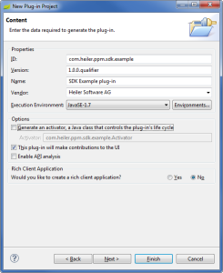
To extend the Web UI, a new OSGi bundle needs to be created. You can either use one of the existing examples that come with the SDK installation package or create a new bundle from scratch.
Create a new OSGi bundle skeleton
Create a new Plug-In Project, setup basic meta data and required bundles
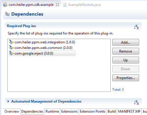
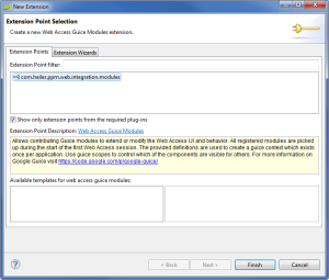
Create a new Guice module
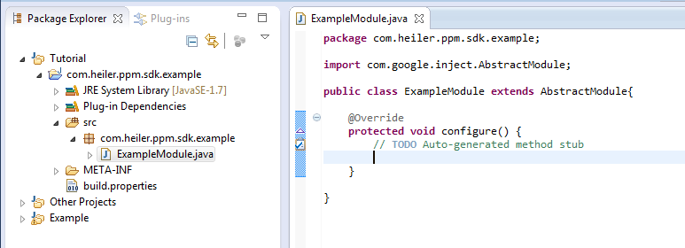
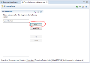
Register the Guice Module at the WebAccess ExtensionPoint
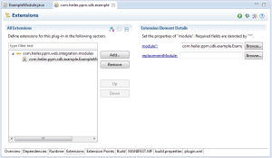
That's it. The ExampleModule class is the starting point for your customizations.
Launch customized application
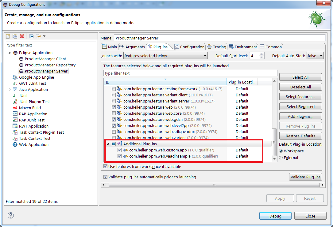
Before launching the Web UI with the Application Server, all new bundles need to be added to the launch configuration.
Extending existing modules
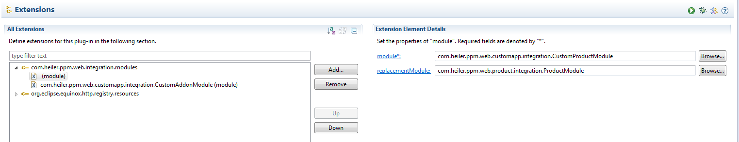
It is often desired to replace or even hide existing functionality from existing components. This can be achieved by specifying a ReplacementModule class at the Integration Extension Point. In this case, the referenced module is replaced with the new contributed module class. Normally you want to extend the existing module and override the methods to apply your changes.
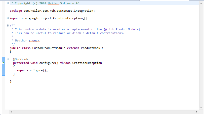
The contribution looks like this:
Typical Use Cases
Working code snippets for the examples shown below can also be found as within the example project com.heiler.ppm.web.custom.app which is part of the SDK distribution package. There you can also find a growing number of additional snippets that illustrate how specific parts of the application can be extended.
Add a custom tab in the detail area
There are two types of tabs to contribute:
A tab contains only fields that can be build using a FieldFormDefinition. In this case, you don't have to write JavaCode but can extend the XML definitions instead.
A tab contains custom content that cannot be generated generically.
For the latter case, a new tab can be implemented by inheriting from AbstractEntityDetailTab. The following example renders a Browser widget in the tab and updates the label based on the selected item.
Add a custom context area
Similar to custom tabs, the Web UI navigation area on the left can also be extended programmatically. In this case, the base class to inherit from is AccordionTreeItem. A sample implementation that provides a link to open a new Browser Window looks like this:
Add a custom action to the table menu bar
The action bar above all main tables can be extended too. Therefore, provide an implementation that inherits from MenuItemWrapper. You need to provide caption, position, group identifier (if used in action menu) and a command callback that contains the logic. Also you can make item invisible by default in action toolbar or added to favorite area.
The following example simply counts the number of all selected products:
public class CustomProductListMenuItem extends MenuItemWrapper{ private static final String MENU_IDENTIFIER = "menu.custom.product.list.count"; @Inject MasterListViewProvider listViewProvider; @Inject Window mainWindow; public CustomProductListMenuItem() { super( MENU_IDENTIFIER ); this.menuPath = "/?after=" + Components.Menu.Product.ACTION_DELETE; this.caption = "Count"; this.setGroupIdentifier( CustomMenuItemGroup.ID ); this.command = new Command() { private static final long serialVersionUID = 1L; @Override public void menuSelected( MenuItem selectedItem ) { openPopup(); } }; } private void openPopup() { ManagedListView productListView = getProductListView(); Set< ListEntry > selection = productListView.getValues(); UI.getCurrent() .showNotification( "You have selected " + selection.size() + " products." ); } private ManagedListView getProductListView() { return this.listViewProvider.get( Product2G._identifier ); }}Register the new menu item in the ExampleModule. Make sure to use the correct component name from Components.Menu to select the product list.
private void contributeProductListMenuItem() { Multibinder< MenuItemWrapper > productMenuItemBinder = getMenuItemBinder( Components.Menu.PRODUCT_LIST_ACTIONS ); productMenuItemBinder.addBinding() .to( CustomProductListMenuItem.class ); }Please note that a registered menu item is displayed for lists in different contexts, e.g. when displaying items of a catalog, structure or after running a search. To restrict the visibility of a menu item to a specific context, the MenuItem implementation can register a listener at the underlying ManagedListView and toggle the visibility whenever the data of the list are updated. Sample:
getProductListView().addListener( new ListView.DataUpdateListener() { private static final long serialVersionUID = 1L; @Override public void onDataUpdate( DataUpdateEvent event ) { // Hide menu when list shows search results boolean isVisible = event.getData() instanceof ListViewChildrenData; setVisible( isVisible ); } });You also can provide new menu groups by extending MenuItemGroup class and defining identifier, i18nKey and order weight (optional):
public class CustomMenuItemGroup extends MenuItemGroup{ public static final String ID = "menu.item.group.custom"; //$NON-NLS-1$ public NavigationMenuItemGroup() { super( ID, "%web.common.menu.item.group.custom", 300 ); //$NON-NLS-1$ }}Register it in module. Make sure to use the correct component name from Components.Menu to select the product list.
Multibinder< MenuItemGroup > menuItemGroupBinder = Multibinder.newSetBinder( binder(), MenuItemGroup.class, Names.named( Components.Menu.PRODUCT_LIST_ACTIONS ) );menuItemGroupBinder.addBinding() .to( CustomMenuItemGroup.class );If you creating new menu for your own list and want to enable xml customization, just add menu identifier to string binding:
Multibinder< String > actionMenus = Multibinder.newSetBinder( binder(), String.class, Names.named( Components.Menu.ACTION_MENU_FILTER_QUALIFIER ) );actionMenus.addBinding() .toInstance( Components.Menu.YOUR_MENU_IDENTIFIER );Implementing and contributing custom flex components for dashboard
It is possible to define customized dashboard components which may then be usable in every dashboard.
The CustomDashboardComponent and CustomDashboardComponentFactory classes show how to implement own dashboard components.
The type attribute in a component element inside a dashboard definition defines which component to use.
The final contribution is done in CustomAddonModule#bindComponentFactory().
Multibinder< ComponentFlexComponentFactory > componentFactories = Multibinder.newSetBinder( binder(), ComponentFlexComponentFactory.class );componentFactories.addBinding() .to( CustomDashboardComponentFactory.class );Contribute Custom Placeholder for XML Configuration Files
Since Product 360 8.0.03 placeholders can be used in XML configuration files to inject context specific values. For example, ${user.language} refers to the UI language that the user selected for log in.
It is also possible, to contribute custom logic to add new placeholders. The following example shows, how to define a placeholder ${user.targetMarket}. The value is derived at runtime based on logged in user properties in the new class TargetMarketLKDefinitionPlaceholderHandler. The placeholder can be used for all logical keys that are based on the enumeration Enum.Territory.
import com.google.inject.Inject;import com.heiler.ppm.acl.commons.principal.Group;import com.heiler.ppm.security.core.Impersonator;import com.heiler.ppm.security.core.LoginToken;import com.heiler.ppm.web.common.definition.placeholder.LKDefinitionPlaceholderHandler;/** * @author sroeck */@SuppressWarnings( "nls" )public class TargetMarketLKDefinitionPlaceholderHandler implements LKDefinitionPlaceholderHandler{ @Inject Impersonator impersonator; @Override public boolean handles( String lkName ) { return lkName.endsWith( ".LK.TargetMarket" ); } @Override public String getUIPlaceholderRepresentation() { return "${user.targetMarket}"; } @Override public Object handle( Object stub, String lkName ) { String result = "US"; // Default Target Market LoginToken loginToken = this.impersonator.getLoginToken(); if ( !loginToken.isGuest() ) { Group[] groups = loginToken.getGroups(); if ( groups.length > 0 ) { // TODO: Extract key for Enum.Territory from user group result = "MX"; } } return result; }}To contribute the custom handler, add the following method to the module class:
private void bindCustomPlaceHolder() { MapBinder< String, LKDefinitionPlaceholderHandler > handlers = MapBinder.newMapBinder( binder(), String.class, LKDefinitionPlaceholderHandler.class, Names.named( Components.PlaceholderHandlers.LKValuePlaceholderHandlers ) ); handlers.addBinding( "${user.targetMarket}" ) .to( TargetMarketLKDefinitionPlaceholderHandler.class ); }The new variable can now be used either in a programmatic definition of forms or list definitions or directly within the XML configuration.
Example:
<definition debugId="article_gdsn_targetmarket_tab" i18NKey="%web.article.detail.tab.targetMarket" permissionId="web.article.detail.tab.targetMarket" position="2" rootEntity="Article"> <column> <fieldGroup displaySectionWidget="true" subEntityId="GDSNTargetMarketExtension"> <field identifier="GDSNTargetMarketExtension.IsActiveInMarket"/> <field identifier="GDSNTargetMarketExtension.IsOrderableUnit"/> <field identifier="GDSNTargetMarketExtension.IsDispatchUnit"/> <field identifier="GDSNTargetMarketExtension.IsInvoiceUnit"/> <field identifier="GDSNTargetMarketExtension.IsPackagingMarkedReturnable"/> <field identifier="GDSNTargetMarketExtension.StartAvailabilityDate"/> <field identifier="GDSNTargetMarketExtension.EndAvailabilityDate"/> <field identifier="GDSNTargetMarketExtension.DiscontinuedDate"/> <logicalKey identifier="ArticleMarketExtensionType.LK.TargetMarket" selectable="true" value="${user.targetMarket}"/> </fieldGroup> </column> </definition>Hide or show detail tabs dependent of arbitrary state of selected object
com.heiler.ppm.web.common.view.detail.VetoTabStrategy interface was created. It has a single method < T > boolean veto( T model, DetailTab< T > detailTab);
All guice-bound implementations of VetoTabStrategy will be called on the selected item change and the selected tab change.
If one of the strategies returns true as the result of veto() method call, the tab will be hidden.
Use detailTab.getId() to identify tabs. For the web definition tabs getId() returns the value specified as the debugId in the definition. For example, product.detailtab.xml contains a tab definition with the following debugId="product_attributes_tab".
Identificators for the tabs of other types are not well-defined.
Example - Hide Price tab for products when the status field is "01 New":
public class CustomVetoTabStrategy implements VetoTabStrategy{ private static final String PRICES_TAB_DEBUG_ID = "detail_selling_prices"; private static final int STATUS_NEW = 100; private static final Log LOG = LogFactory.getLog( CustomVetoTabStrategy.class ); @Inject RepositoryService repositoryService; private FieldPath statusfieldPath; @PostConstruct public void postConstruct() { this.statusfieldPath = RepositoryUtils.getFieldPath( repositoryService.getFieldByIdentifier( Product2G.CurrentStatus ) ); } @Override public < T > boolean veto( T model, DetailTab< T > detailTab ) { boolean result = false; // Check selected tab first before loading data if ( isProductSelected( model ) && isPricesTab( detailTab ) ) { try { EntityProxy proxy = ( ( EntityProxy ) model ); EntityType entityType = proxy.getEntityType(); LoadHint loadHint = new LoadHintBuilder( entityType ).build(); EntityDetailModel detailModel = proxy.getDetailModel( loadHint ); Integer status = ( Integer ) detailModel.getFieldValue( statusfieldPath ); if ( status != null && status.intValue() > STATUS_NEW ) { // Hide Tab for status other than NEW result = true; } } catch ( CoreException e ) { LOG.warn( "Cannot check status field for tab visibility. Returning false to show tab anyway.", e ); } } return result; } private boolean isPricesTab( DetailTab<?> detailTab ) { return PRICES_TAB_DEBUG_ID.equals( detailTab.getId() ); } private < T > boolean isProductSelected( T model ) { String entityIdentifier = null; if ( model instanceof EntityProxy ) { EntityProxy proxy = ( EntityProxy ) model; entityIdentifier = proxy.getEntity().getIdentifier(); } return Product2G._identifier.equals( entityIdentifier ); }}